
Stop Adding Pages to Solve Problems on Your Winery Website in the Pacific Northwest
Welcome, winery owners, vineyard managers, and wine industry professionals in the Pacific Northwest!
Adding more pages to your winery website doesn’t solve your problems—it multiplies them. In 2026, the most successful Pacific Northwest wineries are winning online by consolidating, simplifying, and focusing on quality over quantity. If you want more bookings, club signups, and wine sales, it’s time to stop the page bloat and start building a website that truly works for your business and your visitors.

Introduction: The Page-Bloat Trap in the Pacific Northwest Wine Industry
As a web designer specializing in winery and vineyard websites across Washington and Oregon, I’ve seen a pattern repeat itself year after year: a winery’s website starts simple, but as new needs arise—an event here, a new wine release there, a seasonal tasting, a club update—the instinct is to add another page.
And another. And another.
Before long, what began as a clean, inviting digital tasting room becomes a sprawling maze. Visitors are forced to chase information across a dozen tabs, bounce between outdated event listings, and hunt for basic details like hours or directions.
The result?
Frustrated customers, lost bookings, and a website that’s harder to maintain with every passing season.
This isn’t just a local problem. But in the Pacific Northwest—where over 2,300 wineries compete for attention and more than 60% of sales are direct-to-consumer (DTC)—the stakes are especially high. Your website isn’t just a brochure; it’s your primary storefront, your club signup desk, your reservation system, and your brand’s first impression.
In this post, I’ll show you why adding more pages almost never solves your website’s problems, and how a lean, focused approach delivers better results for wineries in the PNW. We’ll look at real-world examples, UX and SEO evidence, and a practical roadmap for building a site that converts visitors into loyal customers—without sending them on a digital goose chase.
The Pacific Northwest Wine Landscape: Why Your Website Matters More Than Ever
Let’s ground this discussion in the realities of our region:
Washington State now boasts over 1,200 wineries, with major hubs in Walla Walla, Woodinville, Yakima Valley, and Red Mountain. The Columbia Valley AVA alone covers 99% of the state’s wine grapes, and Walla Walla has the highest concentration of tasting rooms in the state.
Oregon has surpassed Washington in total winery count, with over 1,100 bonded wineries. The Willamette Valley AVA produces 75% of Oregon’s wine, with Pinot Noir as the star, while the Rogue Valley is gaining recognition for its reds.
Direct-to-consumer (DTC) sales are the lifeblood of most wineries here—over 60% of sales come from tasting rooms, wine clubs, and online orders.
Wine tourism is robust and year-round, with visitors planning trips online, booking tastings, and researching events before ever setting foot in your vineyard.
With over 2,300 wineries in the region, your website is often the first—and sometimes only—chance to make an impression, capture a booking, or win a club member. In this crowded, competitive landscape, clarity and usability aren’t optional. They’re your edge.
The Problem: Why Adding Pages Fails (and Often Backfires)
1. Sprawling Navigation and Choice Paralysis
Every new page you add demands a spot in your navigation. Before long, your menu balloons from five or six clear options to a dozen or more. This isn’t just a cosmetic issue—it’s a proven UX problem.
Hick’s Law tells us that the more choices you present, the longer it takes users to decide. When visitors see a navigation bar with 10+ items, they stop scanning and start hunting, increasing frustration and abandonment rates.
Best practice: Keep primary navigation to 5–7 items. Exceeding this threshold overwhelms users’ short-term memory and leads to confusion.
Key Finding:
Streamlined navigation increases conversions by up to 25% in e-commerce tests, while sprawling menus drive users away.
2. Redundant and Overlapping Pages
Wineries often create separate pages for closely related topics—“Visit Us”, “Tastings”, “Reservations”, “Events”, “Tours”—each with overlapping or repetitive content. This fragmentation forces visitors to pogo-stick between pages, piecing together information that could (and should) be presented together.
Impact: Users struggle to compare options, miss key details, and may abandon the process entirely.
Expert advice: Group related content into a single, well-structured page with clear sections and local navigation.
3. Thin, Low-Content, and Outdated Pages
Many winery websites are littered with pages that have little more than a title and a date (“Spring Release Party – April 2025”), or event pages that linger long after the event has passed. Others have “About the Winemaker”, “Our History”, and “Our Estate” as separate pages, each with a paragraph or two of content.
SEO penalty: Google’s Helpful Content system (core to its 2026 algorithm) penalizes sites with thin, repetitive, or outdated pages—even if other pages are high quality.
User trust: Outdated or low-value pages undermine your credibility and can mislead or frustrate visitors.
4. Scattered Calls-to-Action (CTAs)
When content is split across redundant pages, your key CTAs—“Book a Tasting”, “Join the Club”, “Buy Now”—get buried or inconsistently presented. Users may miss opportunities to engage, directly impacting your bottom line.
5. Increased Maintenance and Risk
Every new page is another piece of content to update, another potential source of outdated information, and another opportunity for a broken link. For small teams (which describes most PNW wineries), this quickly becomes unsustainable.
Key Takeaway:
More pages mean more work, more risk, and more ways to lose customers.
Real-World Examples: Unnecessary Pages vs. Better Alternatives
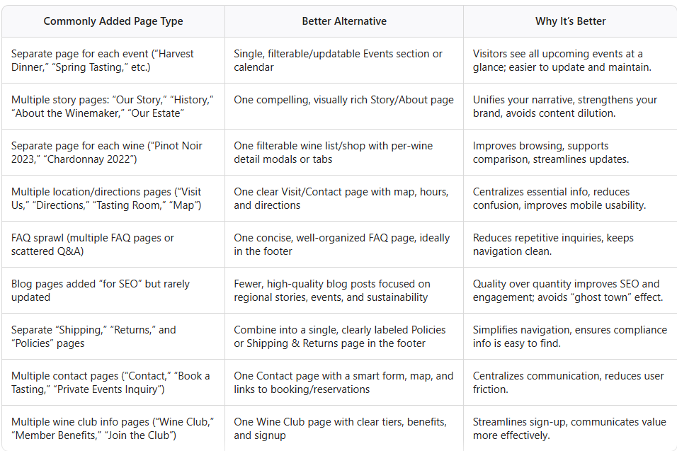
Let’s look at some of the most common page-bloat offenders on winery websites—and the streamlined alternatives that work better for both you and your visitors.
The Evidence: Why Simplification Beats Addition
1. UX and Cognitive Science
Hick’s Law: The more choices, the slower the decision. Streamlined menus (5–7 items) outperform sprawling ones.
Choice Paralysis: Too many options lead to indecision and abandonment.
Conversion Rate Data: Sites with clear, concise navigation see conversion lifts of 3–7% on average, and up to 25% in e-commerce tests.
2. SEO and Google’s Helpful Content System
Thin Content Penalty: Google’s algorithm now evaluates the helpfulness of your entire site. A few thin or outdated pages can drag down your whole domain.
Duplicate Content: Multiple pages covering the same topic dilute your site’s authority and waste crawl budget.
Content Decay: Outdated event pages or old news can trigger site-wide quality classifiers, reducing your visibility—even for your best pages.
3. Core Web Vitals and Site Performance
Speed Matters: Every 1-second delay in load time can reduce conversions by up to 7%. Bloated sites with excessive pages and scripts are harder to keep fast.
Mobile Abandonment: 53% of mobile users abandon a site if it takes more than 3 seconds to load.
Best Practice: Fewer, optimized pages are easier to keep fast and stable, especially on mobile.
4. Conversion-Rate Optimization
Single-Page Conversions: Dedicated landing pages with a single clear CTA outperform multi-step, multi-page funnels.
Empirical Results: Adding unnecessary steps or pages to a conversion flow reduces conversion rates by 4–11% per additional field or step.
Case Studies: Well-built UI and streamlined UX can lift conversion rates by up to 200–400%.
5. Information Architecture and User Testing
Logical Hierarchy: Organizing content from broad categories to specific sub-pages, and limiting depth so users can reach any product or service within three clicks, improves engagement and reduces frustration.
Descriptive Labels: Clear, concise menu labels outperform clever or ambiguous ones by 2–3x in conversion lift.
User Testing: Regular usability studies and analytics reviews are essential to validate IA decisions and adapt to changing user behavior.
The Pacific Northwest Context: Why This Matters Here
1. Over 2,300 Wineries, All Competing for Attention
With more than 1,200 wineries in Washington and 1,100+ in Oregon, the PNW is one of the most competitive wine regions in North America. Your website isn’t just competing with your neighbors—it’s up against Napa, Sonoma, and every other wine destination a traveler might consider.
2. DTC Sales Are Your Lifeline
Over 60% of sales for PNW wineries are direct-to-consumer. That means your website isn’t just a marketing tool—it’s your primary sales channel. Every extra click, every confusing menu, every outdated page is a lost opportunity.
3. Wine Tourism Is Digital-First
Visitors plan their trips online, book tastings, and research events before ever setting foot in your tasting room. If your website is a maze, they’ll move on to the next winery—often before you even know you lost them.
4. Small Teams, Big Demands
Most PNW wineries are small businesses. You don’t have a full-time web team to update a dozen event pages, three club pages, and five different contact forms. A lean, well-structured site is more sustainable and effective for both users and administrators.
Free Guide: Winery Website Conversion Checklist
Practical Solutions: How to Build a Lean, High-Performing Winery Website
1. Consolidate Related Content
Visits, Tastings, Tours, Reservations: Group all visitor information into a single “Visit Us” or “Tasting Room” page. Use clear sections and local navigation (tabs or accordions) for details.
Events: Maintain a single, filterable events calendar or list. Archive past events automatically.
Wine Shop: Use a filterable wine list or shop page. Show per-wine details in modals or tabs, not separate pages.
About/Story: Tell your story on one visually rich page, combining history, team, and philosophy.
Wine Club: One page with clear tiers, benefits, and a frictionless signup form.
Contact: One page with a smart form, map, hours, and links to reservations or private event inquiries.
Policies, FAQ, Accessibility: Place these in the footer, combined where possible.
2. Streamline Navigation
Limit top-level menu items to 5–7.
Use familiar, descriptive labels (“Shop,” “Visit,” “Wine Club,” “Events,” “About,” “Contact”).
Make navigation visible and persistent, especially on desktop.
3. Focus on Content Quality
Every page should have a clear purpose and provide meaningful, up-to-date information.
Use high-quality images, concise copy, and clear CTAs.
Regularly audit and prune outdated, redundant, or low-value pages.
4. Optimize for Mobile and Speed
Prioritize mobile-first design.
Minimize unnecessary scripts and optimize images for fast load times.
Test your site’s Core Web Vitals and address any issues.
5. Make Conversions Easy
Use single-page flows for bookings, club signups, and purchases.
Place prominent, consistent CTAs on all relevant pages.
Offer guest checkout and minimal steps in the purchase flow.
Recommended Lean Site Structure for a Pacific Northwest Winery
Here’s the structure I recommend for most small to mid-sized wineries in the PNW:
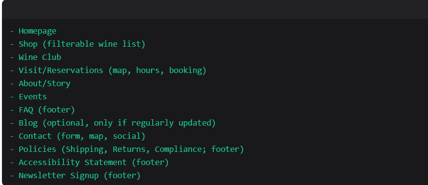
Navigation should be simple and intuitive, with no more than 6–7 top-level items.
All essential info (hours, location, contact, shop, club, story) should be accessible within one or two clicks from the homepage.
Case Study: Before and After
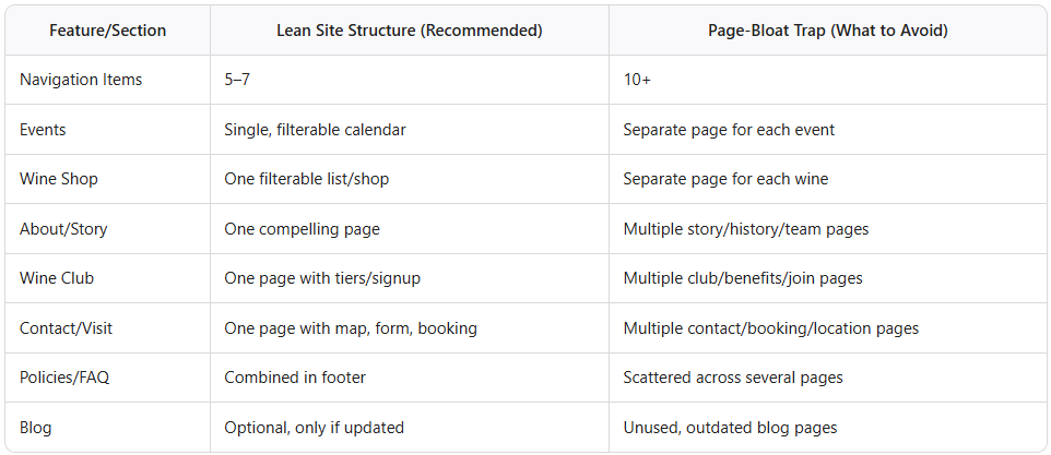
Before: The Page-Bloat Winery
Navigation: 12 items (“Home,” “About Us,” “Our Story,” “History,” “Winemaker,” “Visit Us,” “Tastings,” “Tours,” “Events,” “Spring Release,” “Harvest Dinner,” “Contact”)
Events: Each event has its own page, some outdated.
Wine Shop: Separate page for each wine.
Wine Club: Three pages (“Wine Club,” “Member Benefits,” “Join the Club”)
Contact: Two pages (“Contact,” “Book a Tasting”)
Policies: Scattered across three pages.
Result:
Visitors struggle to find information, bounce between pages, miss key CTAs, and often leave without booking or buying.
After: The Lean, High-Performing Winery Website
Navigation: 6 items (“Home,” “Shop,” “Wine Club,” “Visit,” “Events,” “About”)
Events: Single, filterable events calendar.
Wine Shop: One page with filters and per-wine modals.
Wine Club: One page with clear tiers and signup.
Contact: One page with form, map, and booking links.
Policies, FAQ, Accessibility: Combined in the footer.
Result:
Visitors find what they need quickly, engage with clear CTAs, and are more likely to book, join, or buy.
Frequently Asked Questions
Q: Won’t fewer pages hurt my SEO?
A: No—if you consolidate thin or redundant pages into comprehensive, high-quality ones, your SEO will improve. Google’s Helpful Content system rewards depth, originality, and usefulness, not page count. Thin, outdated, or duplicative pages actually hurt your rankings.
Q: What about events or seasonal offerings?
A: Use a single, filterable events calendar or list. Archive past events automatically. Highlight seasonal offerings on your homepage or events page, not with separate pages for each.
Q: How do I handle multiple locations or tasting rooms?
A: Use a single “Visit” page with clear sections for each location, including maps, hours, and booking links. Avoid separate pages unless locations are truly distinct businesses.
Q: Should I have a blog?
A: Only if you can commit to regular, high-quality updates. A neglected blog is worse than none at all. Focus on stories that matter to your audience—harvest updates, winemaker Q&As, sustainability efforts, and regional news.
The Bottom Line: Less Is More—And More Effective
In the Pacific Northwest wine industry, your website is your most important sales and marketing tool. Adding more pages doesn’t solve your problems—it multiplies them. The wineries winning online in 2026 are those who:
Consolidate related content into comprehensive, well-structured pages.
Streamline navigation for clarity and speed.
Focus on content quality, not quantity.
Optimize for mobile, speed, and conversions.
Regularly audit and prune outdated or redundant pages.
Key Takeaway:
Sometimes more doesn’t subsidize for better. In fact, it usually does the opposite.
Your Next Steps: Build a Website That Works for You (and Your Visitors)
If you’re a winery owner, vineyard manager, or wine-industry business in the Pacific Northwest, now is the time to rethink your website. Stop chasing problems with more pages. Instead, invest in a lean, focused, and user-friendly site that tells your story, drives bookings, and grows your club.
Ready to simplify, streamline, and succeed?
Let’s build a website that works as hard as you do—one that delights your visitors, strengthens your brand, and grows your business in 2026 and beyond.
Summary Table: Lean Site Structure vs. Page-Bloat Trap
Final Thoughts
The Pacific Northwest wine industry is vibrant, competitive, and growing. Your website should reflect the quality, authenticity, and hospitality that define our region—not bury it under a pile of unnecessary pages. By focusing on fewer, better-crafted pages, you’ll create a digital experience that’s as memorable as your wines.
Stop adding pages to solve problems. Start building a website that solves them for good.
If you’re ready to dig deeper and build a winery website that truly works — because it’s built on a foundation of clarity, strategy, and operational excellence — let’s talk. The Pacific Northwest wine world is waiting. right reasons.
Let’s raise a glass to your success—both in wine and beyond! 🍷
As a web designer who specializes in the wine industry, I help wineries and vineyards create beautiful, effective websites and digital marketing strategies tailored to their unique stories and audiences. If you’re ready to boost your online presence and connect with new customers, let’s have a chat about how strategic & smart web design can take your winery to the next level!
Cheers to your success in the wine industry!
Maike
The Golden Square Design Studio
Where Vision Meets Innovation
Creating Stunning & Strategic Websites for Online Success