
Designing for the Person Who Has Never Heard of Your Winery in the Pacific Northwest
Welcome, winery owners, vineyard managers, and wine industry professionals in the Pacific Northwest!
In the crowded Pacific Northwest wine market, your website’s first job is to welcome the person who knows nothing about your winery—no history, no awards, no AVA jargon. The most successful winery websites in 2026 lead with practical, plain-language information, clear calls to action, and a visitor-centric experience that demystifies wine and makes planning a visit effortless.
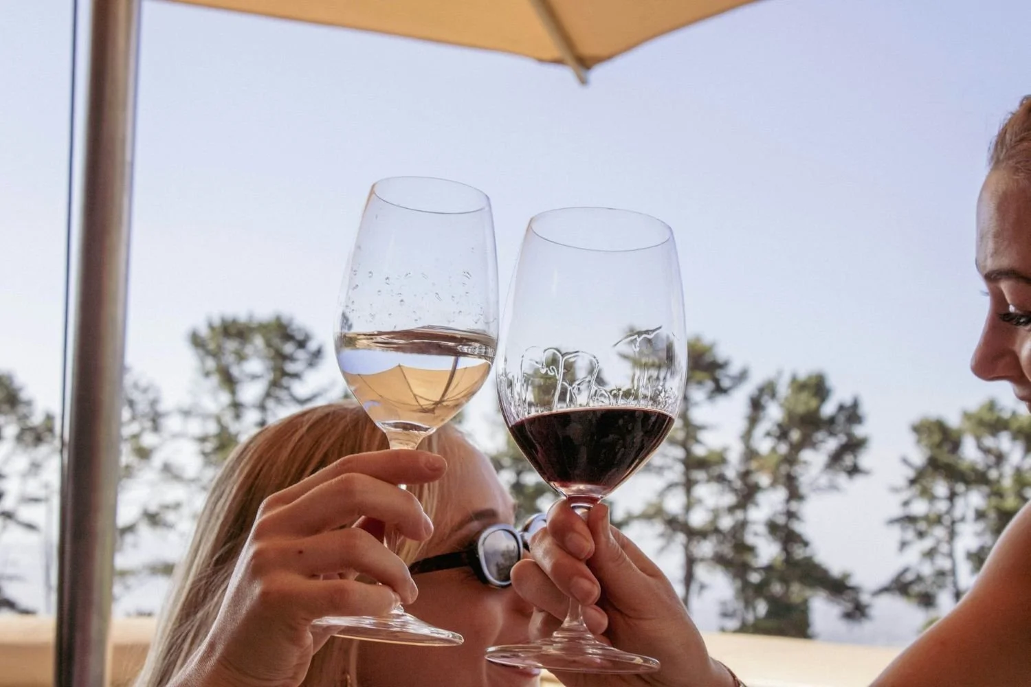
Introduction: The Pacific Northwest Wine Gold Rush—And the Battle for Attention
It’s 2026, and the Pacific Northwest wine industry is more competitive than ever. Oregon boasts over 1,076 wineries, with the Willamette Valley alone home to more than 700 producers. Washington has surged past 1,200 wineries, with tasting rooms dotting the Columbia Valley, Walla Walla, Yakima, Red Mountain, Lake Chelan, and the urban wine hubs of Woodinville and Seattle. The region’s reputation for world-class Pinot Noir, Cabernet Sauvignon, and Syrah is now matched by its diversity—23 AVAs in Oregon, 22 in Washington, and a growing Idaho scene.
But with this abundance comes a new challenge: standing out to the person who has never heard of your winery. In 2025, the region saw a double-digit decline in winery visitation, making every first impression count. Most new visitors discover wineries through online search, regional directories, Instagram, YouTube, and wine media—not through word of mouth or legacy reputation. Direct-to-consumer sales, especially through tasting rooms and online shops, have proven resilient, but only for those wineries that make it easy for newcomers to find, trust, and choose them.
As a web designer specializing in winery clients, I’ve seen firsthand how the “curse of knowledge” can sabotage a winery’s digital presence. Owners and marketers, steeped in their own history and expertise, naturally design for themselves and their peers. But the first-time visitor—the person who knows nothing about your wines, your vineyard, your AVA, or even what “AVA” means—needs something very different.
This post is your guide to designing for that person. We’ll explore why most winery websites fail newcomers, what first-time visitors are actually searching for, and how to structure your site to turn the curious into customers. Along the way, we’ll draw on the latest research, UX best practices, and real-world examples from the Pacific Northwest and beyond.
The Curse of Knowledge: Why Winery Owners Design for Themselves
If you’ve ever sat in a winery marketing meeting, you know the pattern: the conversation quickly turns to the estate’s history, the winemaker’s pedigree, the medals won at obscure competitions, and the unique terroir of the Eola-Amity Hills or Red Mountain. These are points of pride—and rightly so. But they’re also the hallmarks of insider thinking.
Psychologists call this the “curse of knowledge”—the inability to remember what it’s like not to know what you know. In web design, this manifests as jargon-heavy navigation (“Estate Wines”, “Library Selections”), homepages that lead with decades-old stories, and wine descriptions that assume the reader is a budding sommelier.
The result? A website that feels like a private club, not an open invitation. For the person who just Googled “wineries near me” or landed on your site from Instagram, it’s easy to feel lost, unwelcome, or simply confused.
Research from the Nielsen Norman Group and Baymard Institute confirms that when websites are designed from an insider’s perspective, newcomers struggle to find basic information, misunderstand what’s on offer, and often leave before taking any action. The first click is critical: if a visitor’s first click is wrong, their chances of completing their task drop dramatically. And if your homepage doesn’t communicate what you do and why it matters within five seconds, you’ve likely lost them for good.
What First-Time Visitors Are Actually Searching For: The “Near Me” Mindset
Let’s step into the shoes of a first-time visitor. Maybe they’re planning a weekend in the Willamette Valley, or they’re in Seattle looking for a tasting room in Woodinville. They’ve never heard of your winery. They don’t know your winemaker, your AVA, or your awards. What do they want to know?
Consumer research and visitor surveys paint a clear picture. The top priorities for newcomers are practical, experience-focused questions:
How much does a tasting cost?
Do I need a reservation?
Are kids or dogs allowed?
What wines do you make?
Where are you located, and how do I get there?
What will the experience be like?
Are there food options, parking, or accessibility accommodations?
These are not just nice-to-haves—they are the make-or-break details that determine whether someone will visit, book, or buy. Yet, on many winery websites, this information is buried under layers of history, technical wine notes, or insider navigation.
The “near me” mindset is especially important in the Pacific Northwest, where most first-time visitors discover wineries through mobile search, regional directories, and social media. They’re looking for immediate answers, not a deep dive into your vineyard’s soil composition.
Homepage Hierarchy: What to Communicate First (The 5-Second Test)
The homepage is your digital front door. According to the 5-second test—a gold standard in UX research—you have just five seconds to communicate what your business is, what it offers, and why a visitor should care. Fail this test, and most newcomers will bounce.
So, what should your homepage communicate first?
1. Who You Are and Where You Are
Your winery’s name and location should be immediately visible, ideally in the top left with a clear, readable logo. If you’re in the Willamette Valley, say so. If you’re five minutes from downtown Walla Walla, make that clear. Many visitors are searching with local intent—“wineries near me”, “Columbia Gorge tasting rooms”—so location is a trust signal as much as a practical detail.
2. What You Offer (In Plain Language)
A concise, jargon-free tagline or headline should explain what you do. “Family-owned winery in the heart of the Dundee Hills, offering Pinot Noir and Chardonnay tastings daily.” Avoid insider terms like “estate-grown” or “AVA” unless you explain them.
3. The Primary Actions: Visit, Book, Shop
Highlight the top one to three actions a newcomer might take: “Plan Your Visit”, “Book a Tasting”, “Shop Our Wines.” These should be visually prominent, above the fold, and clearly labeled. Avoid hiding them in carousels or ambiguous menus—banner blindness is real, and users ignore anything that looks like an ad or rotating banner.
4. Trust Signals and Social Proof
For an unknown winery, trust is everything. Prominently display contact information, a link to your “About Us” page, and—if you have them—reviews, press mentions, or professional photography that conveys quality and authenticity. But don’t lead with medals or awards; research shows most consumers find them confusing or irrelevant.
5. A Taste of the Experience
Use a high-quality, short video or a hero image that shows what it’s like to visit—people enjoying wine on the patio, sweeping vineyard views, a welcoming tasting room. Video is especially powerful: in 2026, it increases message retention from 10% (text) to 95% (video), and 80% of wineries using video report higher sales.
6. Mobile-First, Always
With most “near me” searches happening on phones, your homepage must load quickly, display key info without pinching or zooming, and make calls to action (like “Book Now”) easy to tap.
Demystifying Wine: Plain-Language Copy Without Dumbing It Down
One of the biggest barriers for newcomers is wine jargon. Academic research confirms that terms like “minerality”, “tannic structure”, “AVA”, and even “body” are inconsistently understood and often intimidating. When confronted with technical descriptions, consumers report lower confidence and are less likely to buy or visit.
The solution is not to dumb down your copy, but to make it welcoming and relatable. Describe your wines in terms that evoke pleasure and experience: “Our Chardonnay is crisp and refreshing, with flavors of green apple and citrus—perfect for a sunny afternoon.”
If you want to mention your AVA or unique soils, do so in a way that connects to the visitor’s experience: “Grown in the cool climate of the Dundee Hills, our Pinot Noir is smooth and fruity, with a hint of spice.”
Contrast this with insider copy: “Our estate Pinot Noir expresses the unique marine sedimentary soils of the Eola-Amity Hills AVA with characteristic minerality and red fruit aromatics.”
To a newcomer, this is a foreign language.
Effective copy also anticipates the visitor’s questions. Instead of a technical tasting note, try: “Not sure what to try? Our friendly staff will guide you through a tasting flight tailored to your preferences—no wine knowledge required.”
The “Plan Your Visit” Page: The Most Underrated Page on a Winery Website
If the homepage is your front door, the “Plan Your Visit” page is your concierge. Yet, on many winery websites, this page is either missing, buried, or treated as an afterthought.
In 2026, the best winery websites dedicate a prominent section—often linked directly from the homepage—to planning a visit.
This page should answer every practical question a newcomer might have:
Tasting Room Hours: Up-to-date, easy to find, and clearly stated.
Reservation System: Direct link to your booking platform (Tock, ExploreTock, VinesOS), with clear instructions.
Tasting Fees: Transparent pricing, with any waivers or discounts explained.
Family and Pet Policies: Are kids or dogs welcome? Any restrictions?
Directions and Parking: Address, map, and step-by-step directions, optimized for mobile.
Accessibility: Information on wheelchair access, restrooms, and any accommodations.
What to Expect: A brief, friendly description of the experience—“Relax on our patio with a glass of wine and sweeping views. No reservation needed for groups under six. Kids and leashed dogs welcome!”
This page is also the place to set expectations and reduce anxiety. Many visitors are new to wine tasting and may be unsure about etiquette, dress code, or whether they need to know anything about wine. A simple FAQ—“Do I need to know anything about wine to enjoy a tasting?”—with a reassuring answer can make all the difference.
Mobile-First Design and Booking Integrations: Meeting Visitors Where They Are
The majority of first-time visitors to Pacific Northwest wineries now discover and interact with your website on their phones. Whether they’re searching “wineries near me” from a hotel room or following a link from Instagram, their expectations are shaped by the best mobile experiences in retail, travel, and hospitality.
A mobile-first winery website in 2026 is not just responsive—it’s designed from the ground up for small screens, fast loading, and touch-friendly navigation. Key information (hours, location, booking) is visible without scrolling. Buttons are large enough to tap. Forms are short and easy to complete.
Booking integrations are now industry standard. Platforms like Tock, ExploreTock, and VinesOS offer seamless reservation systems that work beautifully on mobile. Embedding these directly into your “Plan Your Visit” page—or even your homepage—removes friction and increases conversions. The days of “call us to book” or clunky email forms are over.
E-commerce is equally important. Your online shop should be easy to browse, with clear product images, plain-language descriptions, and a checkout process that works flawlessly on mobile. Local SEO is critical: use schema markup and clear copy to ensure your site appears in “near me” searches and Google Maps results.
Trust Signals and Social Proof: Building Credibility for the Unknown Winery
For the person who has never heard of your winery, trust is the currency that converts curiosity into action. Unlike legacy brands with decades of reputation, most Pacific Northwest wineries are unknown quantities to first-time visitors.
Trust signals should be woven throughout your site, starting with the homepage:
Contact Information: Display your phone number, email, and physical address prominently. A clear “Contact Us” link builds confidence.
About Us: Share your story in a way that’s relatable and welcoming. Focus on your passion for wine, your commitment to hospitality, and what makes your experience unique—not just your history or accolades.
Professional Imagery: Use high-quality photos and videos that show real people enjoying your wines and spaces. Avoid stock photos or empty tasting rooms.
Social Proof: If you have positive reviews, press mentions, or testimonials, feature them in a way that feels authentic. But don’t overdo medals or awards—research shows many consumers are skeptical or confused by them.
Privacy and Accessibility: Link to your privacy policy and accessibility statement. Compliance with WCAG 2.2 is now a baseline requirement, not a differentiator.
These elements not only build trust with newcomers but also support your local SEO and conversion rates.
Free Guide: Winery Website Conversion Checklist
The Insider vs. Outsider Communication Gap: What the Research Says
The gap between what wineries emphasize and what newcomers want is well documented. Academic studies and consumer surveys consistently find that:
Newcomers rank tasting price, reservation info, family/pet policies, experience description, location, and wine styles as HIGH priority.
Wineries tend to lead with medals/awards, vineyard history, winemaker bios, and AVA jargon—all LOW priority for newcomers.
Technical wine terminology is a particular stumbling block. Terms like “minerality”, “tannic”, “AVA”, and even “body” are inconsistently understood and often intimidating. Consumers prefer plain, hedonic descriptors—“smooth”, “fruity”, “crisp”, “pairs well with grilled salmon”—and are more likely to visit or buy when information is presented in this way.
Even the value of awards and medals is overstated. Many consumers are skeptical, finding them confusing or irrelevant to their decision-making. What matters more is a sense of welcome, clarity, and the promise of a good experience.
Contrasting Copy: Insider vs. Outsider
To illustrate the difference, consider these two approaches to describing a tasting experience:
Insider Copy:
“Our estate Pinot Noir expresses the unique marine sedimentary soils of the Eola-Amity Hills AVA with characteristic minerality and red fruit aromatics. Winner of the 2024 Decanter Gold Medal.”
Outsider-Friendly Copy:
“Relax on our patio with a glass of Pinot Noir and enjoy sweeping views of the valley. Our wines are smooth and fruity, perfect for a sunny afternoon. No reservation needed for groups under six. Kids and leashed dogs welcome!”
The first is impressive to an insider, but opaque to a newcomer. The second is inviting, clear, and answers the questions a first-time visitor actually has.
The Role of Storytelling: Making the Winery Relatable
Storytelling still matters—but it must be visitor-focused. Instead of leading with a 500-word history of the vineyard, tell the story of what it’s like to visit. Share moments of joy, discovery, and connection. Introduce your team not just as experts, but as hosts who love sharing wine with new friends.
For example:
“Every Saturday, our winemaker leads a casual tasting on the patio, sharing stories about the harvest and answering any questions—no wine knowledge required. We believe wine is for everyone, and we can’t wait to welcome you.”
This approach bridges the gap between expertise and accessibility, making your winery feel like a place where anyone can belong.
Accessibility, Compliance, and 2026 Design Trends
In 2026, accessibility is not optional. Compliance with WCAG 2.2 standards—alt text for images, keyboard navigation, color contrast, and mobile usability—is now a baseline expectation. Not only does this expand your audience, but it also supports your SEO and legal compliance.
Design trends in the wine industry reflect a blend of tradition and modernity. Serif typography evokes heritage while maintaining clarity. Dark mode options cater to mobile users and accessibility needs. High-quality video is now standard, especially on homepages and visit pages, dramatically increasing engagement and message retention.
But the most important trend is a shift away from legacy storytelling and insider focus, toward actionable, welcoming content that puts the visitor’s needs first.
Auditing Your Site: A Call to Action for Winery Owners
If you’re a winery owner or marketer, now is the time to audit your website from the perspective of someone who has never heard of you.
Here’s how to start:
Take the 5-Second Test: Open your homepage on your phone. Can a stranger tell who you are, where you are, what you offer, and what to do next within five seconds?
Check Your Navigation: Are your main actions—visit, book, shop—immediately visible and clearly labeled? Or are they buried under insider terms?
Review Your Copy: Is your language welcoming and plain, or technical and exclusive? Does it answer the questions newcomers actually have?
Test Your Booking Flow: Can someone book a tasting or plan a visit in under a minute, without calling or emailing?
Look for Trust Signals: Is your contact info easy to find? Do you have real photos, reviews, and a relatable “About Us” page?
Assess Mobile Experience: Does your site load quickly and display key info without scrolling or pinching?
Evaluate Accessibility: Are you compliant with WCAG 2.2? Can everyone, regardless of ability, use your site?
If you find gaps, you’re not alone. Most winery websites were designed for insiders, not outsiders. But in 2026, the winners will be those who welcome the newcomer—who make it easy, inviting, and even fun to discover, visit, and fall in love with your wines.
Conclusion: Designing for the Newcomer Is Designing for Growth
The Pacific Northwest wine industry is at a crossroads. With more wineries than ever and a fiercely competitive market, the difference between thriving and struggling often comes down to how well you welcome the person who has never heard of you.
Designing for the outsider is not about dumbing down your story or erasing your heritage. It’s about meeting people where they are—answering their questions, easing their anxieties, and inviting them into your world with clarity, warmth, and authenticity.
The most successful winery websites in 2026 are those that:
Lead with practical, plain-language information
Make booking and visiting effortless, especially on mobile
Use video and imagery to convey experience, not just history
Build trust with transparency, social proof, and accessibility
Tell stories that connect, not just impress
As a web designer, my advice is simple: design every page, every headline, and every call to action for the person who knows nothing about your winery. Because every loyal customer, every club member, and every advocate started as a newcomer. Make their first impression unforgettable—and you’ll turn curiosity into connection, and connection into lasting success.
Let’s raise a glass to your success—both in wine and beyond! 🍷
As a web designer who specializes in the wine industry, I help wineries and vineyards create beautiful, effective websites and digital marketing strategies tailored to their unique stories and audiences. If you’re ready to boost your online presence and connect with new customers, let’s have a chat about how strategic & smart web design can take your winery to the next level!
Cheers to your success in the wine industry!
Maike
The Golden Square Design Studio
Where Vision Meets Innovation
Creating Stunning & Strategic Websites for Online Success