
Graphic Design Inspiration from the Olympics for Your Winery Website in the Pacific Northwest
Welcome, winery owners, vineyard managers, and wine industry professionals in the Pacific Northwest!
The vibrant, dynamic, and narrative-driven graphic design of the Milano Cortina 2026 Winter Olympics offers a treasure trove of inspiration for Pacific Northwest winery websites. By thoughtfully blending Olympic design elements—like expressive gestures, bold color palettes, and modernist typography—with the region’s artisanal authenticity and landscape-driven branding, wineries can create digital experiences that are both visually stunning and deeply rooted in local identity.
Introduction: Why Olympic Design Matters for Wineries
As a web designer specializing in the wine industry, I’ve seen firsthand how a compelling website can elevate a winery’s brand, attract new visitors, and foster lasting customer loyalty. In today’s digital landscape, standing out requires more than beautiful vineyard photos and elegant fonts—it demands a visual identity that tells a story, evokes emotion, and creates a sense of place.
The Olympic Games are a masterclass in visual storytelling and brand cohesion. Every four years, the world’s attention is captured not just by athletic feats, but by the host city’s unique visual language—logos, colors, motifs, and narratives that celebrate both global unity and local culture. The 2026 Winter Olympics in Cortina-Milano, Italy, are no exception. Their graphic design system is a bold, contemporary blend of Italian spirit, dynamic movement, and expressive human gesture.
But what does Olympic design have to do with your winery in the Pacific Northwest? More than you might think. By drawing inspiration from the Olympics—especially the innovative designs of Milano Cortina 2026—you can infuse your winery’s website with energy, sophistication, and a sense of celebration, all while staying true to the region’s artisanal roots and natural beauty.
In this comprehensive guide, I’ll show you how to translate Olympic graphic design principles into practical, actionable strategies for your winery website. We’ll explore:
The key visual elements of the Milano Cortina 2026 Olympics
How Olympic branding has been adapted in luxury, hospitality, and food & beverage sectors
The unique design trends and branding characteristics of Pacific Northwest wineries
Step-by-step guidance for integrating Olympic inspiration into your website—without losing your local identity
Let’s embark on a creative journey that bridges the grandeur of the Olympics with the intimate, story-driven world of Pacific Northwest wine.
Section 1: The Visual Identity of Milano Cortina 2026—A Masterclass in Modern Branding
1.1 The Emblem: Human Gesture Meets Italian Spirit
The official emblem of the 2026 Winter Olympics is a striking example of how a simple graphic can convey deep meaning. The logo features the number “26” as if traced by a finger in snow or on a foggy window—an homage to spontaneity, human touch, and the transformative power of small gestures.
Fluid, Organic Lines: The emblem’s lines are dynamic and expressive, evoking movement and the Italian tradition of hand gestures.
Color Variations: The primary logo is rendered in icy white or silver, with versions that incorporate gradients and subtle color shifts to reflect light and movement.
Public Engagement: The emblem, named “Futura,” was chosen by public vote, reinforcing the theme of inclusivity and community.
Key Finding:
The “traced in snow” effect and organic lines create a sense of immediacy and warmth, making the logo feel both modern and deeply human.
1.2 Color Palette: Vibrancy Rooted in Landscape
The color system for Milano Cortina 2026 is inspired by the Italian landscape and culture:
Fiery Red: Symbolizes Italian passion and energy.
Glacial White: Evokes snow, purity, and the winter season.
Deep Blue: Represents the Dolomites, night skies, and depth.
Gradients: Used in the Paralympic emblem and backgrounds to suggest movement and the aurora.
These colors are used boldly and vibrantly, creating a festive and energetic atmosphere across all visual assets.
1.3 Typography: Futura—Geometric Clarity and Modernist Roots
The primary typeface is Futura, chosen for its geometric clarity and modernist heritage. Its clean lines echo the shapes of venues, mountains, and cities, reinforcing the connection between the event and its setting.
Consistency: Used in all official communications, signage, and digital assets.
Legibility: Ensures clarity across print and digital platforms.
1.4 Graphic Motifs: Movement, Gesture, and Storytelling
Human Gesture: Motifs are inspired by expressive Italian gestures, central to the visual identity.
Dynamic Shapes: Fluid, generative shapes suggest movement, energy, and connection.
Pictograms: Sixteen sports pictograms, each inspired by the movement and skill of athletes, rendered in a gesture-like, hand-drawn style.
1.5 Poster Designs and Applications
Venue Dressing: Bold colors and dynamic shapes create a festive, immersive environment at venues.
Merchandise: The branding extends to medals, torches, mascots, uniforms, and promotional materials, each reflecting the same design principles.
1.6 Design Principles
Vibrancy and Dynamism: The look is intentionally colorful, energetic, and modern.
Italian Spirit: Rooted in creativity, passion, style, and inclusiveness.
Cohesion and Flexibility: Adaptable to different venues and contexts, reflecting the geographic diversity of the host region.
Narrative-Driven: Every element contributes to a larger story about movement, connection, and the transformative power of small gestures.
Section 2: Olympic Branding Beyond Sports—Lessons from Luxury, Hospitality, and Food & Beverage
2.1 Luxury Goods: LVMH and the Paris 2024 Olympics
Medal and Trophy Design: LVMH brands designed Olympic medals and trunks, blending Parisian heritage with Olympic prestige.
Brand Integration: Campaigns showcased athletes against city landmarks, reinforcing both luxury and Olympic narratives.
Hospitality: Moët & Chandon hosted Olympic events, associating celebration and exclusivity with the brand.
Takeaway:
Integrate local cultural motifs and luxury cues with universal event themes to create a sense of exclusivity and heritage—an approach that translates well to premium wine brands.
2.2 Hospitality: Air France and Paris 2024
Cohesive Experience: Air France created a seamless brand experience for Olympic visitors, using consistent visual themes and messaging.
Visual Storytelling: Campaign visuals featured city landmarks and Olympic motifs, creating a sense of arrival and participation.
Takeaway:
Use consistent, immersive visual storytelling across all customer touchpoints—physical and digital—to reinforce brand identity and create memorable experiences.
2.3 Food & Beverage: Corona Cero and the Olympics
Brand Positioning: Corona Cero aligned itself with Olympic values of balance and well-being.
Thematic Promotions: “This is Living” campaign tied everyday enjoyment to the Olympic spirit, using limited-time products and themed promotions.
Takeaway:
Align product messaging with event values (celebration, moderation, excellence) and use limited-time, themed offerings to create urgency and engagement.
Section 3: Pacific Northwest Winery Website Design—Current Trends and Regional Identity
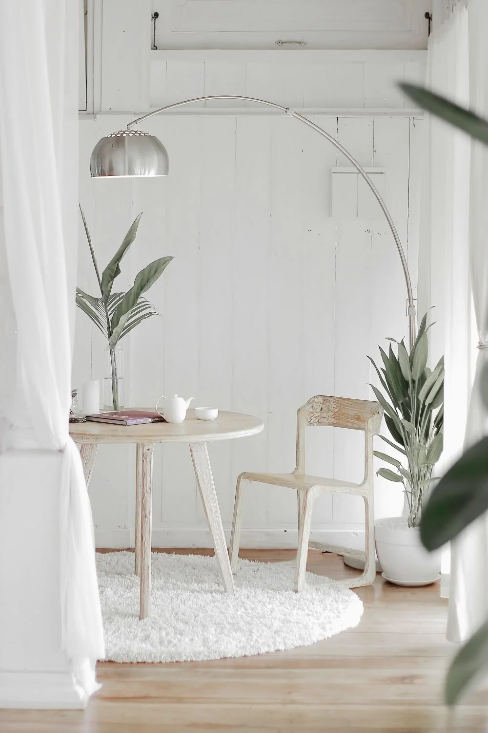
3.1 Visual and Layout Trends
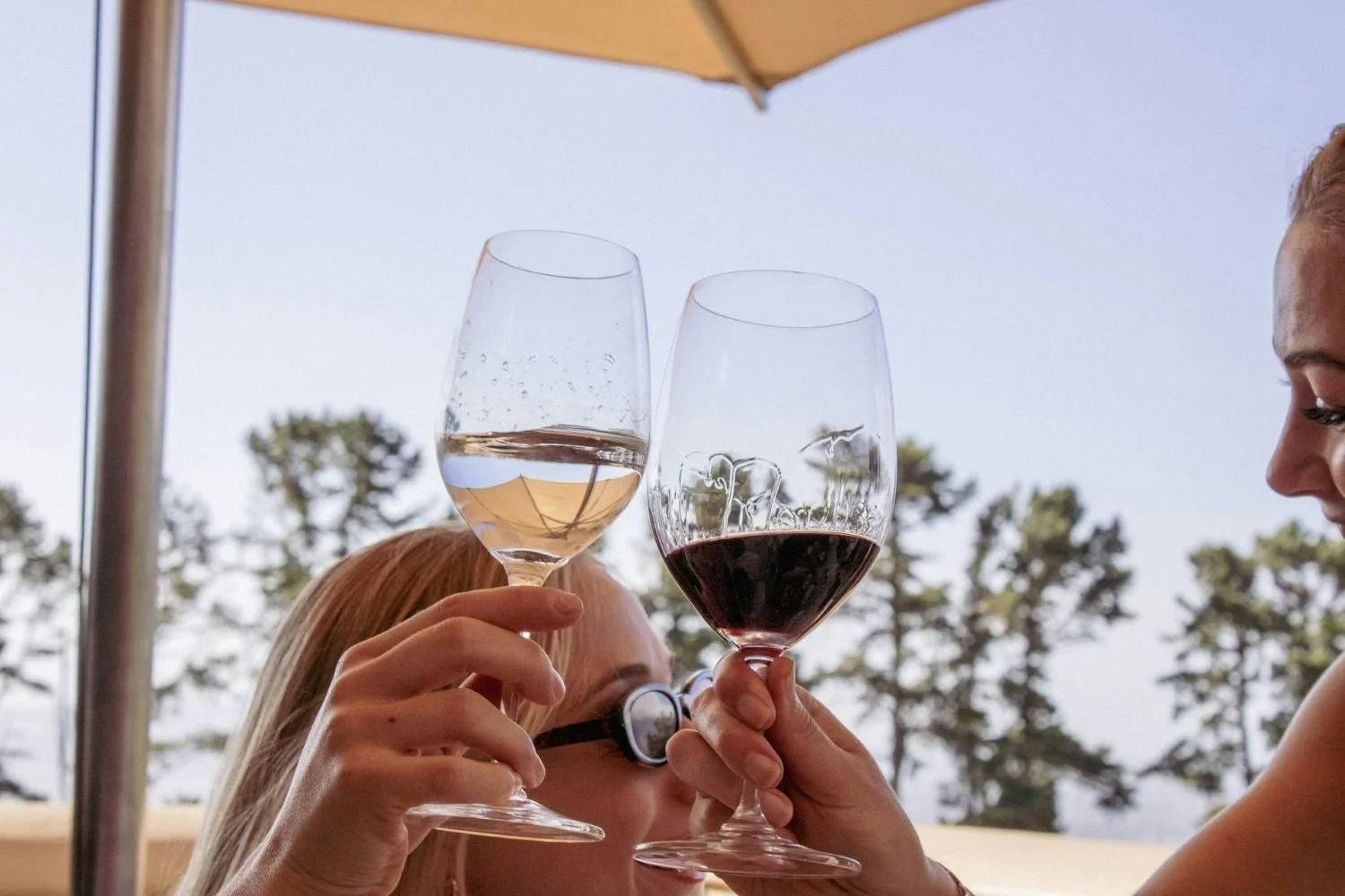
Sepia-Toned and Immersive Photography: Warm, heritage-inspired images of vineyards and winemaking moments.
Elegant, Minimalist Layouts: Clean, spacious designs with ample white space and soft gradients.
Motion and Depth: Scroll-triggered animations and kinetic typography create dynamic user experiences.
Glass Morphism: Frosted, translucent overlays for navigation and product cards.
Hand-Drawn and Layered Visuals: Custom maps, icons, and collage-style storytelling elements.
Card-Based Content Organization: Interactive cards for wine catalogs, events, and team bios.
3.2 Typography and Color Schemes
Elegant Serif and Hand-Drawn Fonts: Convey tradition and sophistication.
Earthy and Neutral Palettes: Forest greens, muted blues, warm browns, and wine-inspired hues like burgundy and gold.
3.3 Imagery and Storytelling
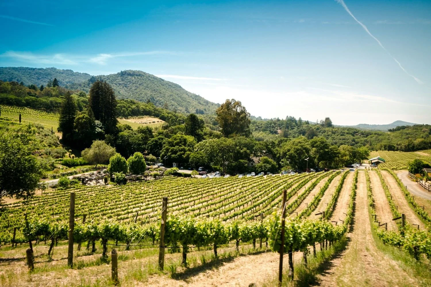
Vineyard and Landscape Photography: Full-screen backgrounds and parallax scrolling sections.
Candid, Process-Oriented Visuals: Behind-the-scenes photos and videos humanize the brand.
3.4 User Experience
Responsive and Mobile-First Design: Optimized for all devices.
Interactive Features: Micro-interactions and scroll-driven animations enhance engagement.
E-Commerce Integration: Seamless online wine sales and event booking.
Story-Driven Navigation: Narrative layouts guide users through the winery’s story.
3.5 Regional Branding Characteristics
Emphasis on Craft and Authenticity: Highlighting small-batch production, family ownership, and sustainable practices.
Landscape as Identity: Showcasing the dramatic landscapes of the PNW—mountains, forests, rivers, and rolling vineyards.
Community and Local Pride: Emphasizing connections to local communities and regional events.
Section 4: Bridging Olympic Inspiration and Pacific Northwest Winery Design
4.1 Why Olympic Design Resonates with Winery Branding
Both the Olympics and Pacific Northwest wineries share a focus on:
Storytelling: Narratives of place, people, and passion.
Celebration: Moments of achievement, community, and joy.
Visual Impact: Memorable, cohesive branding that stands out.
By blending Olympic design elements with regional winery aesthetics, you can create a website that is:
Visually dynamic and modern
Deeply rooted in local identity
Engaging and memorable for visitors
Section 5: Practical Strategies—Applying Milano Cortina 2026 Design to Your Winery Website
5.1 Logo and Emblem Design
Olympic Inspiration:
The “26” emblem’s traced-in-snow effect and organic lines.
Winery Application:
Hand-Drawn Logos: Create a logo that feels as if it’s been traced by hand—perhaps a stylized grapevine, mountain, or wine glass. Use organic, fluid lines to evoke movement and warmth.
Gesture Motifs: Incorporate subtle gesture-inspired elements, such as a swirling pour or a hand holding a glass, to add a human touch.
Example:
A logo that looks like it was drawn in the morning mist on a winery window, echoing the Olympic emblem’s spontaneity.
5.2 Color Palette
Olympic Inspiration:
Fiery reds, glacial whites, deep blues, and gradients.
Winery Application:
Bold Accents: Use vibrant reds or blues as accent colors for calls-to-action, event highlights, or limited-edition releases.
Gradient Overlays: Apply subtle gradients to backgrounds or hero images, suggesting movement and depth.
Seasonal Variations: Adapt the palette for seasonal campaigns—icy blues for winter releases, fiery reds for summer events.
Example:
A homepage hero section with a gradient overlay that transitions from deep blue (evoking the PNW night sky) to glacial white (suggesting snow-capped mountains).
5.3 Typography
Olympic Inspiration:
Futura’s geometric clarity and modernist roots.
Winery Application:
Modern Sans-Serif: Pair a geometric sans-serif (like Futura or a similar font) with an elegant serif for headings and body text.
Kinetic Typography: Use animated or oversized headlines to create visual impact and guide attention.
Example:
A landing page with a bold, animated headline in Futura, introducing the winery’s story or a special event.
5.4 Graphic Motifs and Pictograms
Olympic Inspiration:
Hand-drawn, gesture-inspired pictograms for sports.
Winery Application:
Custom Icons: Develop a set of hand-drawn icons for navigation, wine varietals, and events—think grape clusters, barrels, glasses, and mountains.
Dynamic Shapes: Use fluid, generative shapes as background elements or section dividers, suggesting movement and energy.
Example:
Interactive wine catalog cards featuring custom pictograms for each varietal, echoing the Olympic pictogram style.
5.5 Storytelling and Narrative-Driven Design
Olympic Inspiration:
Every design element contributes to a larger story about movement, connection, and transformation.
Winery Application:
Journey Sections: Dedicate sections to the winery’s history, the winemaker’s journey, and the evolution of the vineyard.
Interactive Timelines: Use scroll-driven animations to guide visitors through key milestones, harvests, and awards.
Example:
A parallax scrolling section that tells the story of the winery’s founding, with dynamic shapes and images that move as the user scrolls.
5.6 Immersive and Experiential Features
Olympic Inspiration:
Venue dressing and immersive environments.
Winery Application:
Virtual Tours: Offer immersive vineyard tours or behind-the-scenes winemaking experiences, using 360° images or video.
Event Calendars: Highlight upcoming tastings, festivals, or Olympic-themed events with visually engaging layouts.
Example:
An interactive map of the vineyard, with clickable sections that reveal stories, photos, and videos.
5.7 Themed Campaigns and Limited-Time Offers
Olympic Inspiration:
Limited-time, themed promotions and merchandise.
Winery Application:
Olympic-Inspired Wine Collections: Create limited-edition wine bundles named after Olympic medals or events (e.g., Gold Reserve, Silver Selection).
Seasonal Promotions: Align special offers with Olympic seasons or local sporting events, using themed graphics and messaging.
Example:
A “Winter Games” wine bundle, promoted with a dynamic, Olympic-inspired landing page.
5.8 Social and Community Engagement
Olympic Inspiration:
Fan engagement and community-driven campaigns.
Winery Application:
User-Generated Content: Encourage customers to share their own “Olympic moments” with your wines, using branded hashtags and social media features.
Collaborations: Partner with local businesses or influencers for cross-promotions and Olympic-themed events.
Example:
A social media contest where customers post photos of their own “victory toasts” with your wine, with winners featured on your website.
5.9 Accessibility and Inclusivity
Olympic Inspiration:
Design for all, reflecting the Olympic value of inclusivity.
Winery Application:
Accessible Design: Ensure your website is accessible to all users—clear navigation, readable fonts, alt text for images, and high-contrast color options.
Example:
A site that meets WCAG accessibility standards, with easy-to-read text and keyboard navigation.
Section 6: Visualizing the Fusion—Sample Layouts and Design Concepts
6.1 Homepage Hero Section
Background: Full-width image of the vineyard at dawn, overlaid with a blue-to-white gradient.
Logo: Hand-drawn, gesture-inspired emblem in the top left.
Headline: Animated Futura headline—“Experience the Spirit of the Pacific Northwest.”
Call-to-Action: Bold red button—“Explore Our Wines.”
6.2 Wine Catalog
Card-Based Layout: Each wine displayed in an interactive card with a custom pictogram.
Color Accents: Medal-inspired color coding (gold, silver, bronze) for reserve, classic, and entry-level wines.
Micro-Interactions: Hover effects reveal tasting notes and food pairings.
6.3 Storytelling Section
Parallax Scrolling: As users scroll, dynamic shapes and images move to reveal the winery’s history.
Timeline: Key milestones marked with hand-drawn icons and short narratives.
6.4 Event Calendar
Glass Morphism Overlay: Translucent event cards over a background image of the tasting room.
Olympic-Themed Events: Special icons and color highlights for limited-time promotions.
6.5 Social Wall
User-Generated Content: Instagram feed showcasing customer photos with branded hashtags.
Community Highlights: Stories from local collaborations and events.
Section 7: Maintaining Regional Authenticity—Blending Olympic Inspiration with PNW Values
7.1 Celebrate Local Landscape and Craft
Use Olympic-inspired colors and motifs, but ground them in the region’s natural beauty—mountains, forests, rivers, and vineyards.
Highlight artisanal production, sustainability, and community involvement.
7.2 Tell Your Unique Story
Pair the grandeur of Olympic design with the intimacy of your winery’s journey.
Use candid photography, handwritten notes, and behind-the-scenes content to humanize your brand.
7.3 Foster Connection and Belonging
Create interactive features that invite visitors to explore, learn, and participate.
Emphasize inclusivity and accessibility, ensuring everyone feels welcome.
Section 8: Step-by-Step Guide—Implementing Olympic Design Inspiration
Step 1: Audit Your Current Website
Identify areas where your visual identity could be more dynamic, cohesive, or narrative-driven.
Note opportunities for bolder color use, custom icons, or interactive features.
Step 2: Define Your Core Story
What makes your winery unique? What stories do you want to tell?
How can you express your values—craft, community, sustainability—through design?
Step 3: Select Olympic-Inspired Elements
Choose 2-3 key elements from Milano Cortina 2026 (e.g., color palette, gesture motifs, typography) to integrate.
Adapt these elements to fit your brand’s personality and regional identity.
Step 4: Design and Prototype
Create mockups of your homepage, wine catalog, and event calendar using the new visual language.
Test different combinations of color, typography, and imagery.
Step 5: Gather Feedback
Share prototypes with staff, loyal customers, and community members.
Refine based on feedback, ensuring the design feels both fresh and authentic.
Step 6: Launch and Promote
Roll out the new design with a campaign that tells the story of your Olympic-inspired transformation.
Use social media, email newsletters, and in-person events to engage your audience.
Step 7: Measure and Iterate
Track engagement, sales, and feedback.
Continue to refine and evolve your design, keeping it vibrant and relevant.
Section 9: Inspiration Gallery—Imagining the Possibilities
Visual Concept 1:
A homepage with a hand-drawn “traced in snow” logo, bold blue-to-white gradient background, and animated Futura headline.Visual Concept 2:
Wine catalog cards with custom pictograms, medal-inspired color accents, and micro-interactions.Visual Concept 3:
Parallax storytelling section with dynamic shapes, candid vineyard photos, and handwritten notes.Visual Concept 4:
Event calendar with glass morphism overlays, Olympic-themed icons, and interactive RSVP forms.Visual Concept 5:
Social wall featuring user-generated “victory toast” photos and community stories.
Conclusion: Elevate Your Winery Website with Olympic Spirit
The Milano Cortina 2026 Winter Olympics have set a new standard for dynamic, narrative-driven graphic design. By drawing inspiration from their visual identity—while honoring the unique character of the Pacific Northwest—you can create a winery website that is both visually stunning and deeply authentic.
Remember:
Blend bold, modern design with regional authenticity.
Tell your story through expressive visuals and interactive features.
Foster community, celebration, and inclusivity at every touchpoint.
The Olympics remind us that great design is about more than aesthetics—it’s about connection, movement, and the power of small gestures to create lasting impact. Bring that spirit to your winery website, and you’ll not only stand out in a crowded market—you’ll invite visitors to become part of your story.
Need help building your winery’s digital presence?
As a web designer specializing in the Pacific Northwest wine industry, I can help you create a website and digital strategy that captures your get started!
If you’re a winery owner or manager in the Pacific Northwest and want expert help building a website that truly works, let’s connect. Focused simplicity always wins—and your story deserves to be told beautifully. 🍇🍷
Let’s raise a glass to your success—both in wine and beyond! 🍷
As a web designer who specializes in the wine industry, I help wineries and vineyards create beautiful, effective websites and digital marketing strategies tailored to their unique stories and audiences. If you’re ready to boost your online presence and connect with new customers, let’s have a chat about how strategic & smart web design can take your winery to the next level!
Cheers to your success in the wine industry!
Maike
The Golden Square Design Studio
Where Vision Meets Innovation
Creating Stunning & Strategic Websites for Online Success