
Can You Overdesign Your Winery Website?
Welcome, winery owners, vineyard managers, and wine industry professionals!
The digital landscape has become an essential part of every business, and the wine industry is no exception. Whether you’re a small boutique vineyard or a sprawling estate with generations of legacy, your website is often the first impression you make on customers, distributors, and industry partners. When it comes to web design, especially in the world of wineries, there’s a temptation to create something visually stunning, immersive, and memorable. But is there such a thing as overdesigning your winery website?
This blog post explores the concept of “overdesign” in winery websites, why it happens, the risks it carries, and how to find the perfect balance between beauty, branding, and usability. Drawing from years of experience designing for wineries and vineyards, I’ll guide you through practical insights, real-world examples, and actionable tips to ensure your website serves your business goals—without getting lost in its own aesthetic ambitions.
What Does “Overdesign” Mean in Web Design?
Overdesign is a term used in web design to describe websites that prioritize visual flair and complexity at the expense of usability, performance, and clarity.
Key Characteristics of Overdesigned Websites:
Excessive animations and effects: Parallax scrolling, hover states, and auto-play videos that distract rather than enhance.
Complicated navigation: Menus that are hard to find or understand, or that change location or style on different pages.
Cluttered layouts: Too many visual elements fighting for attention, leading to cognitive overload.
Unusual typography and color schemes: Font choices and colors that look good in a designer’s portfolio but hinder readability or accessibility.
Heavy imagery: Large background images, sliders, and galleries that slow down page load times.
Why Overdesign Happens:
Desire to impress: Wineries want to convey the beauty and romance of their estates, so they push the limits of design.
Following trends: What’s fashionable in web design (like microinteractions, bold visuals, or asymmetrical layouts) may not be right for every industry.
Lack of strategic focus: When the website’s primary audience and business goals aren’t clearly defined, it’s easy to get carried away with visuals.
Feedback overload: Too many stakeholders involved in the design process can lead to feature creep and unnecessary complexity.
The Unique Challenges of Winery Websites
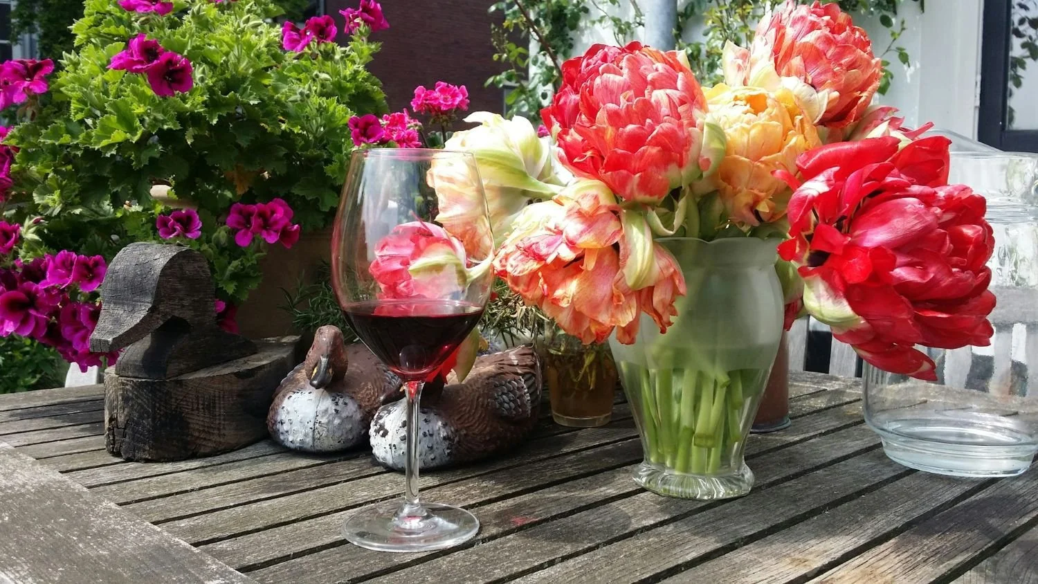
Wine, by its very nature, is a sensory experience—taste, aroma, sight, and even sound (think glasses clinking in a tasting room). Translating this richness to a digital format is challenging.
Wineries often want their websites to evoke the same emotions their wines do.
That’s understandable, but it can be a slippery slope.
Winery Website Needs:
Storytelling: Every winery has a unique story—heritage, terroir, winemaking philosophy.
Product showcase: Wines need to be described, displayed, and easy to purchase.
Visitor engagement: Information about tastings, tours, and events.
Trade and press: Materials and details for distributors, journalists, and partners.
Regulatory compliance: Age verification, shipping restrictions, and legal disclaimers.
Membership and clubs: Wine clubs are a key revenue source, requiring seamless sign-up and management.
Balancing these needs while delivering a beautiful, memorable experience is where many wineries run the risk of overdesign.
The Risks of Overdesign
So, what happens when you overdesign your winery website?
Here are several pitfalls you might encounter:
1. Poor User Experience (UX)
Your website visitors expect to find information quickly and easily. When excessive design elements get in the way, users become frustrated. Unusual navigation, unclear calls to action, and slow load times can drive potential customers away.
2. Reduced Accessibility
Overly fancy fonts, low-contrast color schemes, and complex interactions can make your site unusable for people with visual impairments or those using assistive technologies. This not only alienates a portion of your audience but can also put you at legal risk.
3. Slow Performance
High-resolution images, videos, and flashy effects can drastically slow down your site. Google research shows that even a one-second delay in page load time can reduce conversions by up to 20%. Wine lovers are patient with their drinks, but not with slow websites.
4. Diluted Messaging
When your design screams louder than your story, your message gets lost. The essence of your winery—its heritage, its wines, its people—should take center stage, not the design elements themselves.
5. Decreased Search Engine Rankings
Search engines value websites that are fast, accessible, and easy to navigate. Overdesign can negatively impact all these factors, making it harder for potential customers to discover your winery online.
6. Difficult Maintenance and Updates
Complex, custom-built interfaces can be harder to update or troubleshoot. When you want to add a new wine or update event details, you don’t want to wrestle with a convoluted content management system or custom code.
Real-World Examples: When Overdesign Goes Wrong
Let’s look at a few (anonymized) examples from the wine industry and beyond, to illustrate how overdesign can undermine a website’s effectiveness.
Example 1: The “Scroll Forever” Showcase
A prestigious vineyard wanted a website that mirrored the journey through their estate. The homepage featured a single, ultra-long scrolling page with parallax effects, video backgrounds, and animated text overlays. While visually impressive, users reported getting lost, missing important information, and “scroll fatigue.” The online store was buried halfway down the page, resulting in poor sales conversions.
Example 2: The “Mystery Menu”
A boutique winery opted for a minimalist design with a hidden navigation menu that only appeared if you hovered over a tiny icon. While “clean,” this approach confused new visitors, who couldn’t easily find tasting room hours or contact information. Customer inquiries dropped—and so did tasting room bookings.
Example 3: The “Gallery Overload”
Another client invested in professional photography and wanted to display every image prominently. The result? Slideshows, pop-up galleries, and full-screen backgrounds that took forever to load, especially on mobile. Google Analytics showed a high bounce rate, with visitors abandoning the site before even seeing the wine list.
How to Tell If Your Winery Website Is Overdesigned
Overdesign isn’t always obvious from the inside.
Here’s a quick checklist to help you evaluate your own site:
Does your homepage take more than 3 seconds to load?
Do you use more than 3 different font styles or sizes?
Is critical information (like hours, address, or shop link) hard to find?
Do images or videos autoplay without the user’s consent?
Do you have animations or effects on every page?
Is your menu hidden, misaligned, or inconsistent?
Does your site pass accessibility checks (contrast, alt text, ARIA labels)?
Can visitors buy wine or book a tasting in 2-3 clicks?
Have friends or customers complained about your website being “confusing” or “slow”?
Does your mobile experience differ drastically from desktop?
If you answered “yes” to several of these, your website might be overdesigned.
The Psychology of Winery Website Visitors
Understanding your audience is key to avoiding overdesign. Most visitors to winery websites fall into one or more of these groups:
Wine enthusiasts and collectors: They want detailed information about your wines, vineyard, and winemaking process.
Tourists and locals: Looking for tasting room hours, directions, and event info.
Trade professionals: Interested in technical sheets, distribution info, and press materials.
Wine club members: Need easy access to club management, perks, and exclusive offers.
What do these groups have in common?
They’re looking for information, not a design showcase. Aesthetics matter—they build trust and communicate quality—but not at the expense of clarity and function.
Principles of Effective Winery Website Design
Let’s pivot from the pitfalls to best practices.
What makes for an effective, well-designed winery website?
Here are timeless principles to follow:
1. Clarity Over Complexity
Your website’s purpose should be obvious within seconds. Use straightforward navigation, clear calls to action, and concise messaging.
2. Performance Matters
Optimize images, minimize third-party scripts, and use modern web technologies to ensure your site loads quickly on all devices.
3. Aesthetics With Restraint
Choose a color palette, typography, and photographic style that aligns with your brand, but don’t overload every page with visual flourishes.
4. Mobile-First Design
With over half of web traffic coming from smartphones, your site needs to look and function flawlessly on mobile.
5. Accessibility for All
Meet WCAG (Web Content Accessibility Guidelines) standards to ensure your content is usable by everyone, including those with disabilities.
6. Storytelling That Sells
Use compelling imagery and copy to share your winery’s story, but always guide the visitor toward practical actions—booking a tasting, joining a club, buying wine.
7. Easy Updates
Build your site on a content management system (CMS) that allows you or your staff to make changes without contacting a developer for every update.
Case Studies: Winery Websites That Get It Right
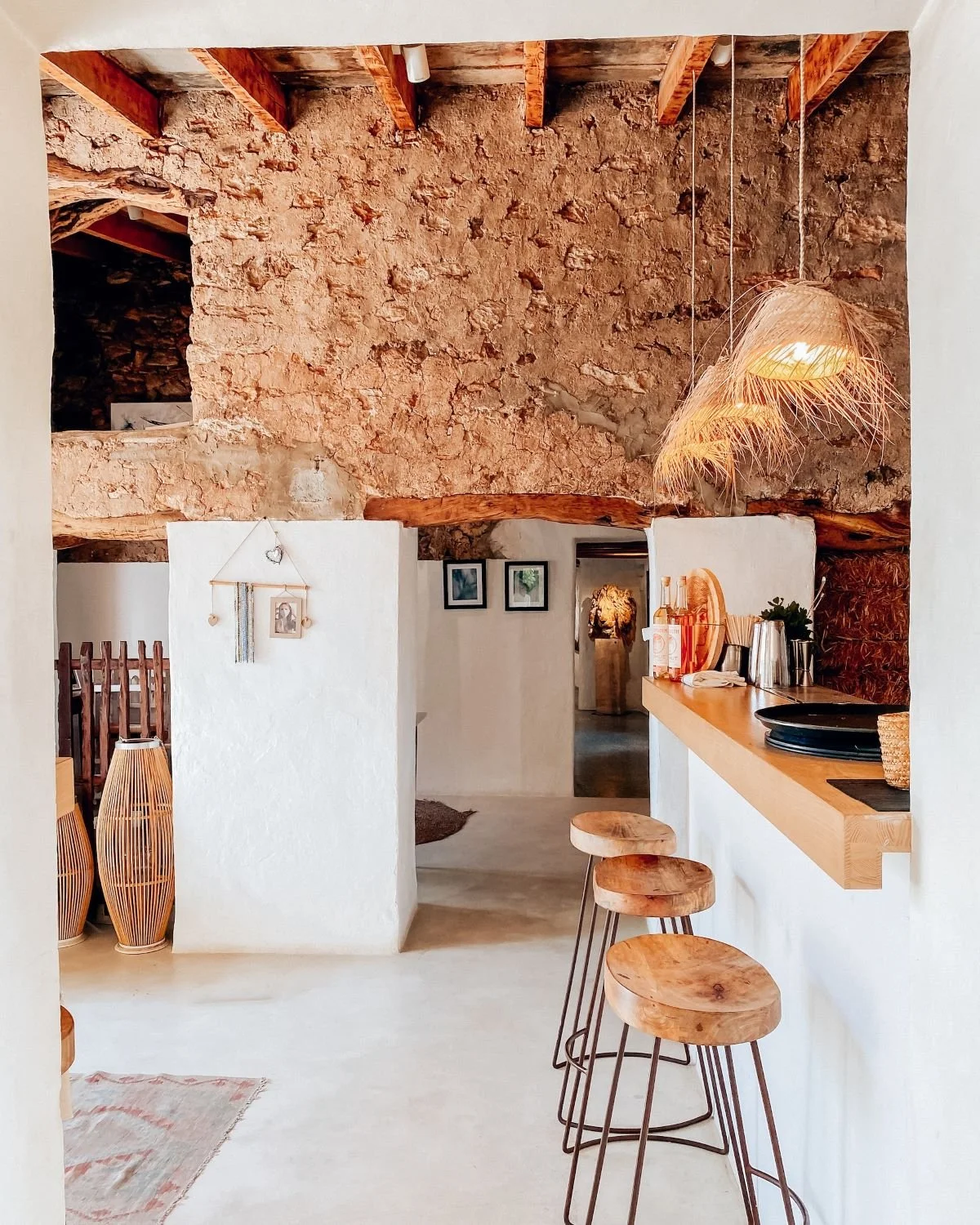
Case Study 1: The Elegant Minimalist
A family-owned vineyard in Oregon wanted their website to reflect the simplicity and authenticity of their wines. We used a muted color palette, classic serif fonts, and large, high-quality images. Navigation was placed prominently at the top, with clear links to “Our Wines,” “Visit Us,” and “Wine Club.” The homepage featured a single, compelling call-to-action: “Plan Your Visit.” Online sales increased by 35% in the first six months after launch.
Case Study 2: The Story-Driven Estate
An Italian winery with a centuries-old legacy needed to communicate both history and innovation. We organized the site around “Our Story,” “Our Wines,” and “Experiences.” Instead of flashy animations, we used subtle transitions and parallax effects sparingly to draw attention to key sections. The wine shop was easy to access, and every product page included tasting notes and food pairings. User engagement (measured by time on site and pages per visit) doubled.
Case Study 3: The Modern Destination
A Napa Valley estate wanted to position itself as both a top-tier producer and a wedding/event venue. We balanced stunning photography with practical information—event packages, FAQs, and contact forms were all easy to find. The site was fast, mobile-responsive, and ADA-compliant. Feedback from event planners and couples was overwhelmingly positive, and bookings increased significantly.
The Role of Branding in Winery Web Design
Branding is more than a logo or color scheme—it’s the sum of every experience a customer has with your winery, online and offline.
A well-designed website should reinforce your brand identity, not overshadow it.
Key Branding Elements for Wineries:
Logo and color palette
Typography
Imagery (vineyards, bottles, people)
Tone of voice
Heritage and story
A good web designer will use these elements to create a cohesive, memorable experience without falling into the trap of overdesign. Consistency builds trust; extravagance breeds confusion.
Balancing Beauty and Usability: Tips for Winery Owners
Here are some practical tips for finding the right balance on your website:
1. Prioritize Your Content Hierarchy
Decide what’s most important—usually your wines, your story, and your visitor experience.
Place these sections front and center; everything else should support them.
2. Use Visuals Strategically
Invest in professional photography, but use images to support, not overwhelm, your message.
Optimize images for web to balance quality with speed.
3. Keep Navigation Simple
Limit your main menu to 5-7 items.
Use clear, descriptive labels. Avoid cutesy or vague language.
4. Limit Fonts and Colors
Stick to two or three complementary fonts and a restrained color palette that matches your brand.
5. Test on Real Users
Ask friends, family, or loyal customers to navigate your site and report any pain points.
Use analytics to see where users get stuck or drop off.
6. Focus on Mobile Experience
Test every page and function on smartphones and tablets.
Make sure buttons are easy to tap, text is readable, and forms are simple.
7. Don’t Reinvent the Wheel
Certain conventions exist for a reason: users expect “Shop” to take them to wines, “Visit” to tasting info, etc.
Novelty is good, but not at the cost of usability.
The Role of Your Web Designer
As a winery owner, you’re not expected to know the ins and outs of web design. That’s what your designer is for. But it’s essential to work with someone who understands the wine industry, your business goals, and your target audience.
A great designer will:
Listen: They’ll learn about your story, your wines, and your customers before proposing solutions.
Advise: They’ll push back if you request features that could hurt usability or performance.
Educate: They’ll explain their design choices and help you understand the trade-offs.
Iterate: They’ll test, refine, and evolve your site over time as your needs change.
Tools and Technologies to Avoid Overdesign
1. Page Builders and Themes
Use reputable web page builders that prioritize performance and accessibility.
Avoid bloated templates with excessive built-in animations or scripts.
2. Image Optimization
Use tools like TinyPNG or ImageOptim to compress images before uploading.
Serve images in modern formats like WebP.
3. Performance Testing
Regularly test your site with Google PageSpeed Insights and GTmetrix.
Address issues like render-blocking scripts, unoptimized images, and excessive plugins.
4. Accessibility Checkers
Use tools like WAVE or axe to spot and fix accessibility issues.
5. Analytics
Set up Google Analytics or other tools to track user behavior.
Use data to guide future updates—don’t rely on guesswork.
Frequently Asked Questions About Winery Website Design
Q: How often should I update my website’s design?
A: Every 3-5 years is typical, but you should regularly update content, images, and features to keep things fresh and accurate.
Q: Do I need a custom website, or can I use a template?
A: For most small to medium wineries, a well-chosen template customized to your brand is sufficient. Custom builds are best for wineries with unique needs or high traffic.
Q: Should I add video backgrounds or auto-play music?
A: Use video backgrounds sparingly and never auto-play music—it’s intrusive and can drive visitors away.
Q: How important is e-commerce?
A: If you sell wine directly to consumers, your online shop should be a central, easy-to-find feature of your site.
Q: What about legal compliance?
A: Always include age verification, shipping policies, and any other legal requirements for your jurisdiction.
Final Thought: The Right Balance
Yes, you absolutely can overdesign your winery website—but you don’t have to.
The most effective winery websites are those that combine visual elegance with usability, performance, and clarity. They tell your story, showcase your wines, and make it easy for customers to engage—whether that’s buying a bottle, booking a tasting, or joining your wine club.
Overdesign is a common trap, especially in an industry as visually rich as wine. But by keeping your audience’s needs front and center, working with experienced designers, and focusing on function as much as form, you’ll create a website that not only looks great but also supports your business goals.
Final Checklist: Is Your Winery Website Just Right?
Fast loading on all devices
Easy, intuitive navigation
Clear calls to action
Consistent branding
Accessible and mobile-friendly
Balanced use of imagery and text
Regularly updated content
E-commerce that’s simple and secure
Legal and regulatory compliance
If you can check off most or all of these, you’re on the right track.
Ready to Refresh Your Winery Website?
If you’re worried your website might be overdesigned, or you want guidance on how to balance beauty with usability, reach out for a free consultation. As a web designer specializing in the wine industry, I can help you tell your story, showcase your wines, and grow your business—without sacrificing performance or user experience.
Remember: A great website isn’t about impressing other designers. It’s about connecting with your customers and making it easy for them to fall in love with your wine.
Here’s to your success—cheers! 🍇🍷
Let’s raise a glass to your success—both in wine and beyond! 🍷
As a web designer who specializes in the wine industry, I help wineries and vineyards create beautiful, effective websites and digital marketing strategies tailored to their unique stories and audiences. If you’re ready to boost your online presence and connect with new customers, let’s chat about how influencer collaborations and smart web design can take your winery to the next level!
Cheers to your success in the wine industry!
Maike
The Golden Square Design Studio
Where Vision Meets Innovation
Creating Stunning & Strategic Websites for Online Success