
Welcome, winery owners, vineyard managers, and wine industry professionals in the Pacific Northwest!
True luxury in winery web design is not achieved by defaulting to minimalism, beige palettes, and serif fonts. Instead, it’s about craftsmanship, editorial detail, evocative imagery, confident pacing, and a deep sense of place—especially in the Pacific Northwest, where the story of the land and the wine is as rich as the product itself.
Introduction: The Minimalism Trap in Winery Web Design
If you’re a premium winery owner in the Pacific Northwest, you’ve likely been pitched the same formula for “luxury” web design: lots of white space, a beige background, a classic serif font, and a stripped-down layout. The result? A site that looks like every other “luxury” brand, from Napa to New York, and says little about what makes your winery—and your region—truly exceptional.
As a web designer who has spent years working with wineries from the Willamette Valley to Walla Walla, I’ve seen firsthand how this formulaic approach can flatten the unique character of a brand. Minimalism has its place, but luxury—real, resonant luxury—demands more. It’s about craftsmanship, detail, and confidence. It’s about telling your story with intention and artistry, not just following trends.
In this post, I’ll break down why the “white space + beige + serif = luxury” equation is outdated, and how you can create a winery website that feels genuinely premium, regionally authentic, and conversion-focused. We’ll explore the nuances of typography, the power of art-directed imagery, the importance of pacing and texture, and how to infuse your site with the confidence and narrative depth that today’s wine lovers crave.
Table of Contents
The Problem with Minimalism as a Shortcut to Luxury
Craftsmanship: The Foundation of True Luxury
Editorial Typography: Beyond the Default Serif
Pacing and Layout: Creating a Confident, Inviting Flow
Imagery: Art Direction, Texture, and Materiality
Color: Moving Beyond Beige
Brand Confidence: Standing Out in the Pacific Northwest
Regional Storytelling: The Soul of PNW Luxury
Luxury and Conversion: Performance Without Compromise
Conclusion: Designing for Legacy, Not Just Looks
The Problem with Minimalism as a Shortcut to Luxury
Minimalism is seductive. It promises clarity, sophistication, and a sense of calm. But when every premium winery website starts to look the same—beige backgrounds, acres of white space, a single elegant serif—something is lost. The individuality, the sense of place, the tactile richness that defines true luxury are flattened into a bland sameness.
Why Minimalism Became the Default
Ease of Execution: Minimalist templates are easy to build and scale.
Association with High-End Brands: Many luxury fashion and lifestyle brands have used minimalism to great effect.
Fear of Overwhelm: Designers and clients worry that too much detail will distract or confuse visitors.
But here’s the truth: Luxury is not about the absence of detail. It’s about the presence of intentional, crafted detail.
The Risks of Minimalism-Only Design
Loss of Brand Identity: Your winery’s unique story and terroir are lost in a sea of sameness.
Missed Emotional Connection: Minimalism can feel cold or generic, especially in a category as sensory and storied as wine.
Reduced Engagement: Visitors may not linger or explore, leading to lower conversion rates for DTC sales and bookings.
Key Finding:
Minimalism, when used as a default, can undermine the very sense of luxury and uniqueness that premium wineries need to convey.
Craftsmanship: The Foundation of True Luxury
Luxury is, at its core, about craftsmanship. In wine, this means attention to every detail—from the vineyard to the bottle. In web design, it means the same: every element, every interaction, every transition is considered and refined.
What Does Craftsmanship Look Like Online?
Custom Typography: Not just picking a serif, but selecting, pairing, and adjusting type for your brand.
Thoughtful Microinteractions: Subtle hover effects, animated transitions, and tactile feedback that feel intentional.
Editorial Layouts: Pages that feel like a beautifully designed magazine spread, not a generic template.
Handcrafted Details: Custom icons, illustrations, or textures that evoke the artistry of winemaking.
Example: Willamette Valley Winery
A Willamette Valley Pinot Noir producer might use hand-drawn topographic lines from their vineyard’s hills as a subtle background texture, or incorporate custom illustrations of native flora. These details don’t clutter the site—they enrich it, creating a sense of place and care.
The Value of Detail
Luxury is in the details. A visitor may not consciously notice the custom kerning on your headlines or the way your navigation animates, but they’ll feel the difference. It’s the digital equivalent of a perfectly finished cork or a hand-embossed label.
Editorial Typography: Beyond the Default Serif
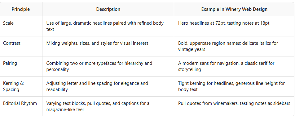
Typography is the voice of your brand online. Too often, “luxury” is equated with simply picking a serif font and calling it a day. But true typographic luxury is about editorial sophistication, scale, and nuance.
Principles of Luxury Typography
Typography in the Pacific Northwest Context
The PNW is a region of contrasts: misty mornings, volcanic soils, rugged coastlines, and lush valleys. Your typography can reflect this:
Willamette Valley: Elegant, high-contrast serifs paired with soft, organic sans-serifs.
Walla Walla: Bold, structured typefaces echoing the region’s pioneering spirit.
Okanagan Valley: Crisp, modern fonts with subtle nods to the region’s youthful energy.
Editorial Typography in Action
Imagine a homepage that opens with a sweeping, oversized headline—“Crafted by the Land, Bottled by Hand”—set in a custom serif with generous tracking. Below, tasting notes are rendered in a lighter weight, with italicized descriptors and subtle color cues. Pull quotes from the winemaker break up the flow, adding rhythm and personality.
Key Takeaway:
Luxury typography is about editorial sophistication, not just font choice. It’s about creating a visual voice that’s as distinctive as your wine.
Pacing and Layout: Creating a Confident, Inviting Flow
Luxury is not rushed. It’s about creating space for discovery, reflection, and delight. On a winery website, this means designing with pacing and flow in mind.
What Is Pacing in Web Design?
Pacing is the rhythm of content as a visitor scrolls. It’s the alternation of dense and open sections, the interplay of imagery and text, the way calls-to-action are introduced.
Elements of Confident Pacing
Varied Section Heights: Not every section needs to be the same height or density. Mix full-bleed imagery with compact text blocks.
Editorial Breaks: Use pull quotes, testimonials, or tasting notes to break up long pages.
Scroll Animations: Subtle fades, parallax effects, or transitions that guide the eye without overwhelming.
Whitespace as Pause: Use whitespace not as emptiness, but as a deliberate pause—like a breath between sips.
Layout Confidence
A confident layout doesn’t hide behind minimalism. It uses bold grids, overlapping elements, and unexpected compositions to create visual interest.
Example: Red Mountain Winery
A Red Mountain winery might use a strong, asymmetric grid to echo the region’s dramatic slopes. Large, full-bleed images of the vineyard at sunset are paired with tight, focused tasting notes. Calls-to-action are placed with intention, not just at the bottom of the page.
Imagery: Art Direction, Texture, and Materiality
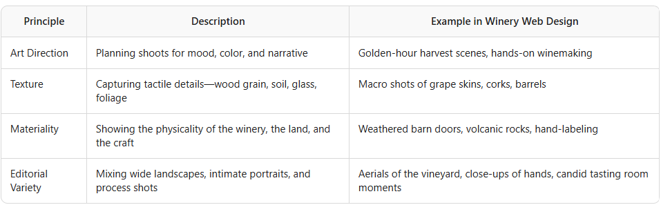
If typography is the voice, imagery is the soul. Too many winery websites rely on generic vineyard shots or stock bottle photos. True luxury comes from art-directed, editorial photography that tells a story.
Principles of Luxury Winery Imagery
Imagery in the Pacific Northwest
The PNW is visually rich: misty mornings in the Willamette, basalt cliffs in Walla Walla, the shimmering lakes of Okanagan. Your imagery should evoke this sense of place.
Willamette Valley: Soft, diffused light; lush greens; foggy mornings.
Walla Walla: Warm, golden tones; dramatic skies; rugged textures.
Okanagan Valley: Crisp blues; sunlit vineyards; lakeside reflections.
Editorial Imagery in Action
Instead of a sterile bottle shot on beige, imagine a hero image of your winemaker’s hands, stained with grape juice, holding a cluster of Pinot Noir. Or a sweeping drone shot of your vineyard at sunrise, mist curling over the rows. These images tell a story of craft, place, and passion.
Key Finding:
Luxury imagery is art-directed, tactile, and regionally specific. It invites visitors to feel the land and the craft behind every bottle.
Free Guide: Winery Website Conversion Checklist
Color: Moving Beyond Beige
Beige is safe. It’s neutral, calming, and associated with “tasteful” design. But in the Pacific Northwest, where the landscape is alive with color, why limit yourself?
The Power of Color in Luxury Design
Evoking Place: Use colors drawn from your region—mossy greens, basalt grays, deep reds, lake blues.
Creating Mood: Rich, saturated colors can feel luxurious and inviting.
Differentiation: Color is a powerful way to stand out in a sea of beige competitors.
Example Color Palettes by Region

Using Color with Confidence
Luxury is about confidence. Don’t be afraid to use bold color blocks, colored overlays on images, or colored type for emphasis. The key is restraint and harmony—not defaulting to beige, but using color as a storytelling tool.
Brand Confidence: Standing Out in the Pacific Northwest
Luxury brands don’t apologize for who they are. They stand tall, tell their story, and invite visitors to join them. Your website should do the same.
What Does Brand Confidence Look Like?
Distinctive Voice: Copy that’s specific, evocative, and true to your brand—not generic “elevated” language.
Bold Layouts: Grids and compositions that feel intentional and unique.
Clear Calls-to-Action: Confidently invite visitors to book, buy, or explore—don’t hide your offers.
Editorial Storytelling: Share your history, your philosophy, your people. Luxury is about narrative depth.
Example: Woodinville Winery
A Woodinville winery might open with a bold statement: “Urban Edge, Rural Roots.” The site uses a mix of industrial textures and lush vineyard imagery, reflecting the region’s unique blend of city and country. Calls-to-action are clear and inviting: “Book Your Tasting,” “Join Our Allocation List.”
Regional Storytelling: The Soul of PNW Luxury
The Pacific Northwest is not Napa. It’s not Bordeaux. It’s a region with its own history, climate, and culture. Your website should celebrate this.
Elements of Regional Storytelling
Terroir: Share the specifics of your soil, climate, and vineyard practices.
People: Feature your winemakers, vineyard workers, and community.
History: Tell the story of your land, your family, your evolution.
Culture: Highlight local food pairings, events, and collaborations.
Storytelling in Action
A Walla Walla winery might feature a timeline of the region’s wine pioneers, interspersed with archival photos and oral histories. An Okanagan producer could showcase the interplay of lake and land, with interactive maps and seasonal photo essays.
Key Takeaway:
Luxury is rooted in authenticity. The more specific and personal your story, the more luxurious your brand will feel.
Luxury and Conversion: Performance Without Compromise
Some fear that luxury design means sacrificing conversion—fewer sales, fewer bookings. But the opposite is true: a well-crafted, confident site builds trust and desire, leading to stronger DTC performance.
How Luxury Design Drives Conversion
Trust: Editorial detail and craftsmanship signal quality and care.
Desire: Art-directed imagery and storytelling create emotional connection.
Clarity: Confident layouts and calls-to-action guide visitors to act.
Differentiation: A unique, regionally authentic site stands out in search and social.
Conversion Best Practices for Premium Wineries
Prominent, Inviting CTAs: “Book a Tasting,” “Shop Our Wines,” “Join the Club.”
Editorial Product Pages: Rich descriptions, tasting notes, winemaker quotes.
Integrated Storytelling: Weave narrative into every page, not just the “About” section.
Mobile-First Design: Ensure luxury and performance on every device.
Conclusion: Designing for Legacy, Not Just Looks
Minimalism is easy. Luxury is hard. But for premium wineries in the Pacific Northwest, the rewards of true luxury design are immense: deeper engagement, stronger brand loyalty, and higher conversion.
Don’t settle for the beige, serif, white-space formula. Invest in craftsmanship, editorial detail, art-directed imagery, confident pacing, and authentic storytelling. Celebrate your region, your people, your craft. That’s what luxury looks like in 2026—and it’s what your winery deserves.
Summary Box:
Luxury is not minimalism by default.
Craftsmanship, detail, and confidence are the hallmarks of premium winery web design.
Editorial typography, art-directed imagery, and regional storytelling create emotional connection and drive conversion.
Celebrate the Pacific Northwest’s unique character—don’t hide it behind beige and white space.
Ready to Elevate Your Winery Website?
If you’re ready to move beyond minimalism and create a site that truly reflects the luxury and uniqueness of your winery, let’s talk. The Pacific Northwest has a story to tell—and your website should be its most compelling chapter.
Let’s raise a glass to your success—both in wine and beyond! 🍷
As a web designer who specializes in the wine industry, I help wineries and vineyards create beautiful, effective websites and digital marketing strategies tailored to their unique stories and audiences. If you’re ready to boost your online presence and connect with new customers, let’s have a chat about how strategic & smart web design can take your winery to the next level!
Cheers to your success in the wine industry!
Maike
The Golden Square Design Studio
Where Vision Meets Innovation
Creating Stunning & Strategic Websites for Online Success