
Welcome, winery owners, vineyard managers, and wine industry professionals in the Pacific Northwest!
The humble website footer is not just a digital afterthought—it’s a strategic asset that can drive conversions, build trust, and enhance the visitor experience for your Pacific Northwest winery. When thoughtfully designed, your footer becomes a powerful secondary navigation system, a local SEO booster, and a subtle but vital part of your brand’s digital hospitality.
Introduction: The Overlooked Real Estate Beneath Your Winery Website
Let’s be honest: when most winery owners think about their website, the footer is the last thing on their minds. You’ve spent thousands on stunning hero photography, crafted poetic wine descriptions, and maybe even hired a copywriter to tell your story.
But the footer? It’s just that strip at the bottom, right? A place for copyright and maybe a few social icons?
If that’s your mindset, you’re not alone. But as a web designer who’s spent the last decade building websites for wineries, vineyards, and wine businesses across the Pacific Northwest, I can tell you: the footer is the most overlooked, undervalued, and misunderstood piece of digital real estate on your site.
Here’s the truth: your footer is not a dumping ground. It’s a strategic asset—a secondary navigation system, a trust-builder, a local SEO tool, and a conversion opportunity. For wineries in Oregon and Washington, where visitors are often planning day trips, navigating rural roads, and making split-second decisions about where to stop, your footer can be the difference between a new wine club member and a missed opportunity.
In this post, I’ll show you why the footer matters more than you think, what belongs there (and what doesn’t), and how to transform your footer from an afterthought into a genuine business asset.
Why the Footer Matters More Than You Think
The UX Reality: Motivated Visitors Scroll to the Bottom
Here’s a little-known fact from the world of user experience (UX): visitors who scroll all the way to the bottom of your page are not just idly browsing. They’re looking for something.
Maybe it’s your phone number, your tasting room hours, or directions to your vineyard. Maybe they want to join your wine club, sign up for your newsletter, or check if you ship to their state.
These are highly motivated users. They’ve invested time in your site, and now they’re seeking the next step. If your footer doesn’t deliver what they need—if it’s missing, cluttered, or confusing—you’ve just introduced friction at the worst possible moment.
Key Finding:
According to established UX principles (as championed by the Nielsen Norman Group), users expect to find contact information, hours, and navigation in the footer. Failing to meet this expectation creates confusion, frustration, and lost business.
The Pacific Northwest Context: Why It’s Even More Critical Here
Now, let’s talk about the Pacific Northwest. Our wine regions—Willamette Valley, Columbia Valley, Walla Walla Valley, Yakima Valley, Red Mountain—are spread across vast, often rural landscapes. Many wineries are tucked away on winding back roads, far from city centers. Your visitors are often planning their trips on the fly, using their phones as they drive from Portland, Seattle, or Spokane.
Imagine this scenario: a visitor is planning a day of tasting in the Dundee Hills. They’re on your website, scrolling for your hours and address. If your footer doesn’t have this information—if it’s buried, outdated, or missing—they might just give up and head to the next winery on their list. That’s a lost tasting fee, a lost bottle sale, and maybe a lost wine club member.
In short: your footer is not just a digital detail. For Pacific Northwest wineries, it’s a lifeline to your most valuable visitors.
The Footer as Secondary Navigation
Beyond the Top Menu: The Footer’s Unique Role
Most winery websites have a beautiful, well-organized top navigation menu. That’s great—it’s where most users start their journey. But what happens when a visitor scrolls past your hero image, reads your story, browses your wines, and still hasn’t found what they’re looking for?
That’s where the footer comes in.
The footer acts as a secondary navigation system. It’s the safety net for users who:
Want to complete a task (book a tasting, join the wine club, get directions)
Couldn’t find what they needed in the main menu
Are on long pages (like blog posts or event listings) and don’t want to scroll back up
Are on mobile and find the hamburger menu overwhelming
A well-architected footer mirrors your site’s information architecture in a condensed, organized form. It groups links by category—Visit Us, Shop, Our Wines, Learn More, Legal—making it easy for users to find what they need, fast.
Fat Footer vs. Minimal Footer: Which Is Right for Your Winery?
There are two main approaches to footer design:
Fat Footer: A multi-column layout with grouped links, contact info, calls to action, and trust signals. Ideal for wineries with multiple offerings (tasting room, events, wine club, online shop).
Minimal Footer: A clean, single-line footer with just the essentials (copyright, privacy policy, maybe a phone number). Suitable for very small wineries or landing pages.
For most Pacific Northwest wineries, the fat footer is the way to go. It provides the structure and information your visitors need, without overwhelming them.
What Belongs in a Pacific Northwest Winery Footer — The Essential Elements
Let’s get practical. Here’s what every winery footer in the Pacific Northwest should include—and why.
1. Contact Block (NAP: Name, Address, Phone)
Why it matters: This is the single most important element for local SEO and user trust. It must be plain text (not an image) for accessibility and search engines.
NAP Consistency: Your address and phone number must match exactly what’s on your Google Business Profile and local directories. Inconsistent NAP data confuses Google and hurts your local search rankings.
2. Tasting Room Hours
Why it matters: Hours change seasonally. Many PNW wineries have different summer and winter hours, or are appointment-only. Outdated hours cause real-world frustration.
Pro Tip: Add a note about seasonal changes and a reminder to update them regularly.
3. Directions or Map Link
Why it matters: A simple “Get Directions” link that opens Google Maps is invaluable for mobile users. Don’t embed a full map—it slows your site.
4. Appointment Booking Link
Why it matters: If you’re by-appointment-only or offer seated tastings, make it easy to book. Link directly to your booking system (Tock, Resy, or your own).
5. Wine Club / Membership Link
Why it matters: The wine club is the lifeblood of DTC sales. The footer is prime real estate for a “Join Our Wine Club” call to action.
6. Shop / Buy Wine Link
Why it matters: Direct visitors to your online store (Shopify, Commerce7, WineDirect, etc.) with a clear, prominent link.
7. Events / Calendar Link
Why it matters: PNW wineries host events year-round. A footer link to your events calendar keeps visitors engaged and informed.
8. Newsletter Signup
Why it matters: Capture emails from engaged visitors who aren’t ready to buy yet. Keep it simple—first name and email is enough.
9. Social Media Links
Why it matters: Only link to platforms you actively use. A dead Instagram link is worse than none.
10. Age Verification Statement
Why it matters: Required for alcohol sales. A simple line like “You must be 21 years of age or older to purchase wine” is both a legal and professional necessity.
11. Alcohol Shipping Compliance Notice
Why it matters: DTC shipping laws are complex. At minimum, note which states you ship to or link to a shipping info page.
12. Association Badge/Logo
Why it matters: If you’re a member of the Oregon Wine Board or Washington State Wine, display the badge. It’s a trust signal for out-of-region visitors.
13. Copyright Line and Year
Why it matters: Simple, professional, and expected. Keep it updated.
14. Privacy Policy and Terms of Service Links
Why it matters: Required by law (CCPA, GDPR) and by most email marketing platforms.
15. Accessibility Statement
Why it matters: Increasingly important for legal compliance and ethical business. A proactive accessibility statement signals good faith.
What Does NOT Belong in a Winery Footer — The Dumping Ground Mistakes
Let’s talk about what to avoid. The footer is not a catch-all for everything you couldn’t fit elsewhere.
1. Every Page Listed as Individual Links
Mistake: Dumping your entire sitemap into the footer creates a wall of links—confusing and overwhelming.
2. Keyword-Stuffed Text Blocks
Mistake: Old-school SEO tactics like “Willamette Valley Pinot Noir | Best Winery in Oregon…” look amateur and don’t help your rankings.
3. Outdated Awards or Press Mentions
Mistake: Listing your 2016 Wine Spectator score in the footer undermines credibility. Keep it current or remove it.
4. Full Embedded Google Map
Mistake: Slows down your site, especially on mobile. Use a linked address instead.
5. Auto-Playing Video or Animated Images
Mistake: Distracting and kills conversions. The footer is not the place for multimedia.
6. Secondary Blog Posts or Article Teasers
Mistake: The footer is for navigation and trust, not content discovery.
7. Redundant Login/Admin Links
Mistake: Remove CMS auto-added admin links. They don’t belong in the public footer.
8. Broken or Outdated Social Media Links
Mistake: Audit your social links every six months. A dead link is worse than none.
9. Duplicate Calls to Action
Mistake: Don’t cram multiple CTAs with equal weight. Prioritize the most important action.
Free Guide: Winery Website Conversion Checklist
Footer Design and Technical Considerations
Contrast and Readability
Best Practice: Footer text must have a minimum 4.5:1 contrast ratio for normal text (WCAG 2.1 AA). Avoid dark green on black or burgundy on charcoal.
Mobile Behavior
Best Practice: On mobile, footer columns should stack vertically. Links must be large enough to tap (minimum 44×44px). Accordion-style sections can help, but test for usability.
Footer Load Time
Best Practice: Keep the footer lean. Avoid heavy images, embedded widgets, or multiple JavaScript elements.
Semantic HTML
Best Practice: Use the HTML5 <footer> element. Screen readers announce landmark regions, aiding accessibility.
Schema Markup
Best Practice: Add LocalBusiness schema markup to your contact block. This helps Google understand your NAP data.
Link Auditing
Best Practice: Set a quarterly reminder to click every footer link. Dead links hurt UX and SEO.
The Footer as a Local SEO Asset for PNW Wineries
Let’s bring the local SEO thread together. For wineries in the Pacific Northwest, local search is the primary digital acquisition channel. Visitors searching “wineries near Woodinville,” “Walla Walla tasting room open today,” or “wine tasting in Hood River” are your most valuable traffic.
A footer with consistent NAP data, present on every page, reinforces Google’s confidence in your location. It’s a foundational local SEO signal that many wineries neglect.
Key Takeaway:
Your footer is not just for visitors—it’s for Google, too. A well-structured footer boosts your local search visibility and drives more qualified traffic to your tasting room.
A Real-World Winery Footer Audit Scenario
Let’s make this concrete.
The Scenario
You run a small, 3,000-case winery in the Chehalem Mountains AVA. Your tasting room is open Thursday through Sunday. Here’s what your current footer has:
A copyright line
Three social icons
A “Contact Us” link
Now, imagine a visitor on their phone, driving from Portland on a Friday afternoon. They’re looking for:
Your address (to plug into Google Maps)
Your hours (are you open today?)
A phone number (to call if they’re running late)
A link to book a tasting (if you’re by appointment)
A quick way to join your wine club (if they loved your wines last time)
Confirmation that you ship to their state
If your footer doesn’t provide this information—clearly, concisely, and in plain text—you’ve just lost a sale. Maybe more than one.
The Stakes
This isn’t hypothetical. I’ve seen it happen. A visitor can’t find your hours, assumes you’re closed, and heads to a competitor. Or they can’t find your address, get lost, and give up. Or they want to join your wine club but can’t find the link.The footer is the last thing they see before they leave your site. Make it count.
A Recommended Winery Footer Structure
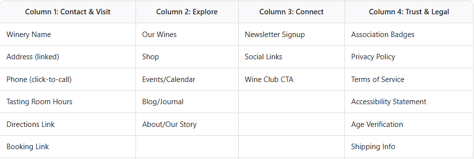
Here’s a practical, proven layout for a Pacific Northwest winery footer. This structure balances usability, SEO, and brand trust.
Desktop Layout: Four Columns
Bottom Bar:
Copyright line (e.g., © 2026 Chehalem Ridge Winery)
Designed-by credit (optional)
Sitemap link (optional)
Mobile Layout
Columns stack vertically
Links are large and easy to tap
Accordion sections for each group (Contact, Explore, Connect, Trust & Legal)
Footer Visual Example
Imagine a clean, four-column footer with clear headings, grouped links, and plenty of white space. The contact block is prominent, the wine club CTA stands out, and the legal links are unobtrusive but accessible. On mobile, everything stacks neatly, with no tiny links or clutter.
Conclusion: The Footer Is the Digital Back-of-House—Make It Shine
The footer is the last thing a visitor sees before they leave your page. For winery owners who have invested in great wine, beautiful labels, a stunning tasting room, and a welcoming team, the footer is the digital equivalent of a clean, well-organized back-of-house. Nobody talks about it when it’s right. But when it’s wrong—when a customer can’t find your hours, dials a disconnected phone number, or can’t figure out which states you ship to—you feel it in your sales numbers.
In the Pacific Northwest, where the wine country experience is deeply tied to discovering hidden-gem wineries on rural back roads, your website footer is often the first real conversation between a potential visitor and your brand. Make it worth their time.
Final Thought:
Don’t let your footer be an afterthought. Treat it as a strategic asset—a place to guide, reassure, and convert your most motivated visitors. Your bottom line will thank you.
Let’s raise a glass to your success—both in wine and beyond! 🍷
As a web designer who specializes in the wine industry, I help wineries and vineyards create beautiful, effective websites and digital marketing strategies tailored to their unique stories and audiences. If you’re ready to boost your online presence and connect with new customers, let’s have a chat about how strategic & smart web design can take your winery to the next level!
Cheers to your success in the wine industry!
Maike
The Golden Square Design Studio
Where Vision Meets Innovation
Creating Stunning & Strategic Websites for Online Success