
Website Color Psychology for a Wine Business in the Pacific Northwest
Welcome, winery owners, vineyard managers, and wine industry professionals!
In the lush, rolling hills of the Pacific Northwest, the wine industry thrives—not just in the vineyards, but also online. As a Pacific Northwest web designer specializing in winery and vineyard websites, I’ve witnessed how a carefully crafted digital presence can elevate a wine business.
One of the most influential—yet often underestimated—elements of web design is color psychology. For wineries, which rely on storytelling, heritage, and sensory experiences, color isn’t just decorative; it’s strategic.
This comprehensive guide will explore website color psychology for a wine business in the Pacific Northwest. We’ll dive deep into the emotional and cultural meanings of colors, the regional influences that shape consumer expectations, and practical design strategies that harmonize aesthetics with conversion goals.
Whether you’re a small family-run vineyard in Willamette Valley or a bustling tasting room in Walla Walla, this post is your roadmap to harnessing color for a more compelling, memorable, and successful website.

Why Color Psychology Matters for Wine Business Websites
Color psychology is the study of how colors influence perceptions, emotions, and behaviors. In web design, color sets the tone for your brand, guides visitors’ attention, and impacts their decisions—often subconsciously.
For wine businesses, color is even more critical because:
Wine is a sensory product: Your website is the first “taste” many customers will have of your brand.
Emotional connection: Wine purchasing is often driven by emotion, tradition, and aspiration.
Regional storytelling: The Pacific Northwest has a distinct identity—your color palette can communicate place, provenance, and promise.
A thoughtfully chosen color scheme can:
Instill trust and credibility
Evoke sensory associations (taste, aroma, terroir)
Differentiate your winery from competitors
Encourage online purchases and tasting room visits
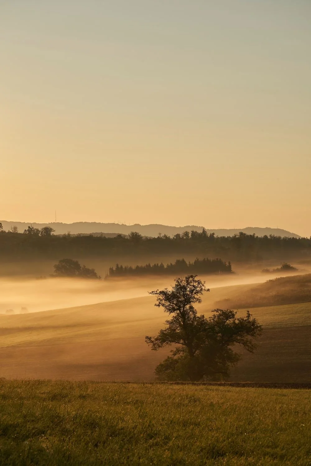
Understanding the Pacific Northwest’s Unique Wine Identity
Before diving into color palettes, let’s consider what makes the Pacific Northwest wine scene special. This region, encompassing Oregon, Washington, and parts of Idaho and British Columbia, is known for:
Natural beauty: Evergreen forests, rugged coastlines, volcanic soils, and misty mountains
Climate: Cool, wet winters and warm, dry summers—ideal for Pinot Noir, Riesling, Chardonnay, Syrah, and Cabernet Sauvignon
Values: Sustainability, authenticity, artisanal craftsmanship, and community
Cultural influences: A blend of Pacific Rim, indigenous, and European traditions
Your website’s color palette should reflect these qualities, creating an immediate sense of place and resonance with your target audience.
The Emotional Language of Color: What Different Hues Communicate
Let’s break down the key colors most relevant to Pacific Northwest wineries and what each can communicate on your website.
1. Green
Associations: Growth, life, nature, sustainability, organic practices
Pacific Northwest resonance: Deep evergreen forests, vineyard canopies, mossy earth
Use cases: Backgrounds, banners, buttons for eco-friendly initiatives
Psychological effects: Calming, rejuvenating, trustworthy
2. Burgundy & Deep Reds
Associations: Richness, luxury, tradition, passion, the color of wine itself
Regional resonance: Pinot Noir, Cabernet grapes; autumn leaves; wine barrels
Use cases: Call-to-action buttons, accents, headers, product highlights
Psychological effects: Warmth, sophistication, appetite stimulation
3. Earth Tones (Brown, Ochre, Taupe)
Associations: Stability, heritage, terroir, hand-crafted quality
Pacific Northwest resonance: Volcanic soils, aged wood, leather, stone cellars
Use cases: Backgrounds, navigation bars, footers, section dividers
Psychological effects: Groundedness, authenticity, reliability
4. Blues
Associations: Serenity, trust, coolness, reflection
Regional resonance: Puget Sound, Columbia River, overcast skies, lakes
Use cases: Accents, backgrounds, overlays, watermarks
Psychological effects: Calm, professionalism, focus
5. Purples & Mauves
Associations: Creativity, luxury, mystery, the color of certain grape varieties
Regional resonance: Lavender fields, wine grape skins, mountain wildflowers
Use cases: Highlights, navigation, section backgrounds
Psychological effects: Spirituality, creativity, exclusivity
6. Whites & Light Grays
Associations: Cleanliness, simplicity, openness, modernity
Regional resonance: Morning mists, snowy peaks, minimalist design
Use cases: Main backgrounds, negative space, text backgrounds
Psychological effects: Freshness, clarity, approachability
7. Gold & Copper Accents
Associations: Quality, celebration, prestige, awards
Regional resonance: Autumn foliage, award medals, sunset light
Use cases: Buttons, icons, award callouts, special offers
Psychological effects: Excitement, luxury, exclusivity
Building a Color Palette for Your Winery Website
Let’s put these insights to work. Here’s a process for building an effective palette:
Step 1: Define Your Brand Personality
Are you a rustic, family-run vineyard? An avant-garde urban winery? A luxury destination? Your brand personality should guide your color choices:
Artisanal & Rustic: Earth tones, greens, muted reds
Modern & Innovative: Crisp whites, dark grays, bold accent colors
Luxury & Heritage: Deep burgundies, gold, navy blue
Step 2: Research Your Audience
Pacific Northwest wine consumers value authenticity, sustainability, and unique experiences. They’re often well-educated and environmentally conscious. Your palette should feel organic, sophisticated, and welcoming—not flashy or artificial.
Step 3: Analyze Competitors
Look at regional wineries’ websites. Are there common themes? How can you differentiate? For example, if everyone uses green, consider integrating purples or copper accents for distinction.
Step 4: Choose Core and Supporting Colors
A typical web palette includes:
Primary color: Main brand color (e.g., deep green or burgundy)
Secondary color: Supports and contrasts (e.g., ochre, navy, or taupe)
Accent color: Draws attention to calls-to-action (e.g., gold or copper)
Neutral palette: Whites, grays, soft browns for backgrounds and text
Step 5: Test for Accessibility
Ensure sufficient contrast for readability and compliance with accessibility standards. Tools like the WebAIM Contrast Checker are invaluable.
Practical Color Palette Examples
Let’s see how these ideas come together with sample palettes. (For each, I’ll provide hex codes you can use in your website’s CSS.)
1. “Evergreen Elegance”
Deep Forest Green:
#234B32Pinot Noir Burgundy:
#7C2832Misty White:
#F8F8F8Volcanic Earth Brown:
#8D6748Gold Accent:
#D4AF37
2. “Modern Pacific”
Slate Blue:
#506680Vineyard Green:
#46634ADriftwood Gray:
#E5E6E4Wine Grape Purple:
#5A345ACopper Accent:
#B87333
3. “Rustic Roots”
Warm Taupe:
#B8A47EPinot Red:
#A23E48Soft Gray:
#F4F4F4Moss Green:
#7A8D63Amber Accent:
#EBA937
Using Color to Guide User Experience
Color isn’t just about aesthetics—it’s a tool for shaping user behavior.
1. Navigation and Hierarchy
Use your primary color for navigation bars and active menu items.
Employ accent colors for calls-to-action (e.g., “Book a Tasting”, “Shop Now”).
Use neutral or softer shades for background sections to allow featured content to stand out.
2. Storytelling
Section backgrounds can mirror the journey: earthy browns for “Our Vineyard”, misty whites for “Visit Us”, rich reds for “Our Wines”.
Use photography aligned with your palette: lush vineyard greens, golden harvest sunsets, deep reds of wine in the glass.
3. Calls-to-Action
Buttons should “pop” against their background—use gold, copper, or a contrasting shade.
Limit the number of accent colors to avoid visual clutter.
4. Accessibility and Readability
Ensure text and background colors have sufficient contrast.
Avoid color combinations that are difficult for color-blind users; pair color cues with icons or underlines.
5. Seasonal Adjustments
Consider subtle tweaks to your palette for special events or seasonal campaigns (e.g., deeper reds and golds for autumn, brighter greens for spring releases).
Case Studies: Pacific Northwest Winery Websites
1. Sokol Blosser (Oregon)
Palette: Forest green, cream, muted gold
Effect: Evokes lush vineyard landscape, premium quality, sustainability
Standout feature: Consistent use of green and gold for buttons and highlights, reinforcing brand identity
2. Chateau Ste. Michelle (Washington)
Palette: Deep navy, burgundy, white, gold accents
Effect: Heritage, tradition, and luxury
Standout feature: Gold highlights on awards and CTA buttons create a sense of prestige
3. Willamette Valley Vineyards
Palette: Earth tones, burgundy, sage green, gray
Effect: Authentic, grounded, inviting
Standout feature: Subtle use of burgundy for headings and navigation, with earth backgrounds
Photography, Texture, and Color
Color isn’t just about flat backgrounds or buttons. It’s also about the way your website’s imagery and textures reinforce your palette.
Photography: Choose images with colors that match or complement your palette. Lush vineyard shots, deep red wines, golden sunsets, and rustic wood barrels all reinforce your brand identity.
Texture: Subtle background textures—like linen, wood grain, or paper—add warmth and authenticity, especially when paired with earth tones.
Overlays: Use semi-transparent color overlays on photos (
rgbavalues in CSS) to unify disparate images and ensure text legibility.
Common Mistakes to Avoid
Even with the best intentions, color can go wrong. Here’s what to watch out for:
Overuse of color: Too many bold colors can overwhelm visitors. Stick to 2-3 main colors plus neutrals.
Ignoring accessibility: Fancy color combinations mean nothing if users can’t read your content.
Color clashes with photography: Make sure button and text colors stand out against busy backgrounds.
Trendy palettes that don’t fit your brand: What works for a tech startup won’t necessarily work for a winery rooted in tradition.
Neglecting mobile users: Test your palette on different devices and lighting conditions.
A/B Testing and Iteration
The best palette is one that performs. Use tools like Google Optimize or Hotjar to test different color schemes for calls-to-action and landing pages. Track:
Click-through rates on buttons
Time on site
Bounce rate
Conversion rate for newsletter signups, bookings, or purchases
Iterate based on results—sometimes small tweaks (like changing a button from burgundy to gold) can have big impacts.
Integrating Color with Your Full Brand Identity
Your website does not exist in a vacuum. Make sure your color scheme is consistent across:
Physical labels and packaging
Tasting room décor
Menus and printed materials
Social media graphics
Consistency builds trust and recognition.
Tools for Color Selection and Implementation
Here are some resources to help you build and test your palette:
Coolors.co: Generate color schemes and export hex codes
Adobe Color: Explore harmonies and color rules
WebAIM Contrast Checker: Test readability
Material UI Color Tool: Preview palettes in UI mockups
Trends and Innovations in Winery Web Design
The Pacific Northwest wine scene is innovative and dynamic. Here are some emerging approaches to color in web design:
Dark mode: Offering a dark color scheme (deep greens, blues, or burgundies) for users who prefer it
Animated gradients: Subtle movement in color backgrounds to evoke mist or changing seasons
Interactive color cues: Buttons or icons that change color on hover to encourage interaction
Personalization: Adjusting palettes for returning visitors or based on time of day
Final Tips for Wine Business Owners
Stay true to your story: Your website’s colors should tell the story of your land, your vines, and your values.
Evoke the senses: Use color to suggest aroma, flavor, and place—invite visitors to imagine the experience of your wine.
Keep it simple: A restrained, purposeful palette feels more sophisticated and trustworthy.
Consult a professional: Color is complex—partner with a web designer who understands both color psychology and the Pacific Northwest wine industry.

Website Color Psychology
Color is more than decoration. For a Pacific Northwest wine business, it’s a powerful storytelling tool and a driver of digital success. By understanding color psychology and the unique character of our region, you can create a website that converts visitors into lifelong customers—before they ever set foot in your tasting room.
If you’re ready to refresh your winery’s online presence or want a custom color palette tailored to your brand and audience, reach out to a web designer who speaks your language—and your region. A beautiful, effective website is just a palette away.
Ready to raise your glass (and your conversions) with smarter color choices? Let’s create a digital tasting room as inviting as your vineyard - from your vineyard to your customers’ tables!🍇🍷
Let’s raise a glass to your success—both in wine and beyond! 🍷
As a web designer who specializes in the wine industry, I help wineries and vineyards create beautiful, effective websites and digital marketing strategies tailored to their unique stories and audiences. If you’re ready to boost your online presence and connect with new customers, let’s chat about how influencer collaborations and smart web design can take your winery to the next level!
Cheers to your success in the wine industry!
Maike
The Golden Square Design Studio
Where Vision Meets Innovation
Creating Stunning & Strategic Websites for Online Success